PROJECT DEVELOPMENT.
PROJECT DEVELOPMENT.
FROM START TO FINISH
Below is a featured package that includes the magazine cover and the corresponding interior story. Developing a feature like this involved many steps: understanding the visual needs of the writers, coordinating with subjects, assisting with and directing photoshoots, designing page layouts, and creating supporting graphics. I'll give a brief look into my process using The Great Outdoors issue as an example.
It all begins with the cover. Las Vegas Weekly is a city magazine distributed throughout Las Vegas and parts of Southern California, competing for attention alongside other publications. The cover needs to be bold, clear, and impactful—grabbing the reader’s eye within seconds.
This particular issue focused on recreational outdoor activities available in and around Las Vegas. We sent a photographer to Red Rock Canyon to capture a local mountain biking enthusiast in action. The goal was to convey a sense of energy and adrenaline, with a tight composition that still showcased the natural beauty of the landscape.
The photographer shot hundreds of images, and together we selected the one that best delivered the story. Once I received the edited photo, I applied the typography and graphic treatments, along with any necessary photo manipulation. In this case, that included masking the rider and background to create depth and allow the Weekly logo to interact with the environment more dynamically.
The next step is the feature spread inside the magazine, which typically opens with a visually striking splash image to draw readers in. However, we didn’t always have the resources to commission original photography. In those cases, it was up to me to find creative solutions.
For this piece, I reached out to a company featured in the article to see if they had any courtesy images to contribute. Fortunately, they did—and I was able to use this stunning photo of Emerald Cave along the Black Canyon River, taken during one of their guided tours.
Laying out pages can often feel like a game of Tetris—balancing copy, quotes, images, captions, and other elements into a layout that's both visually engaging and easy to navigate. The key is establishing a clear hierarchy while maintaining aesthetic flow and informational accuracy.
In this spread, I used the stunning Red Rock Canyon landscape as the visual anchor, building the layout around it and thoughtfully integrating the necessary text elements to support the story without overwhelming the image.
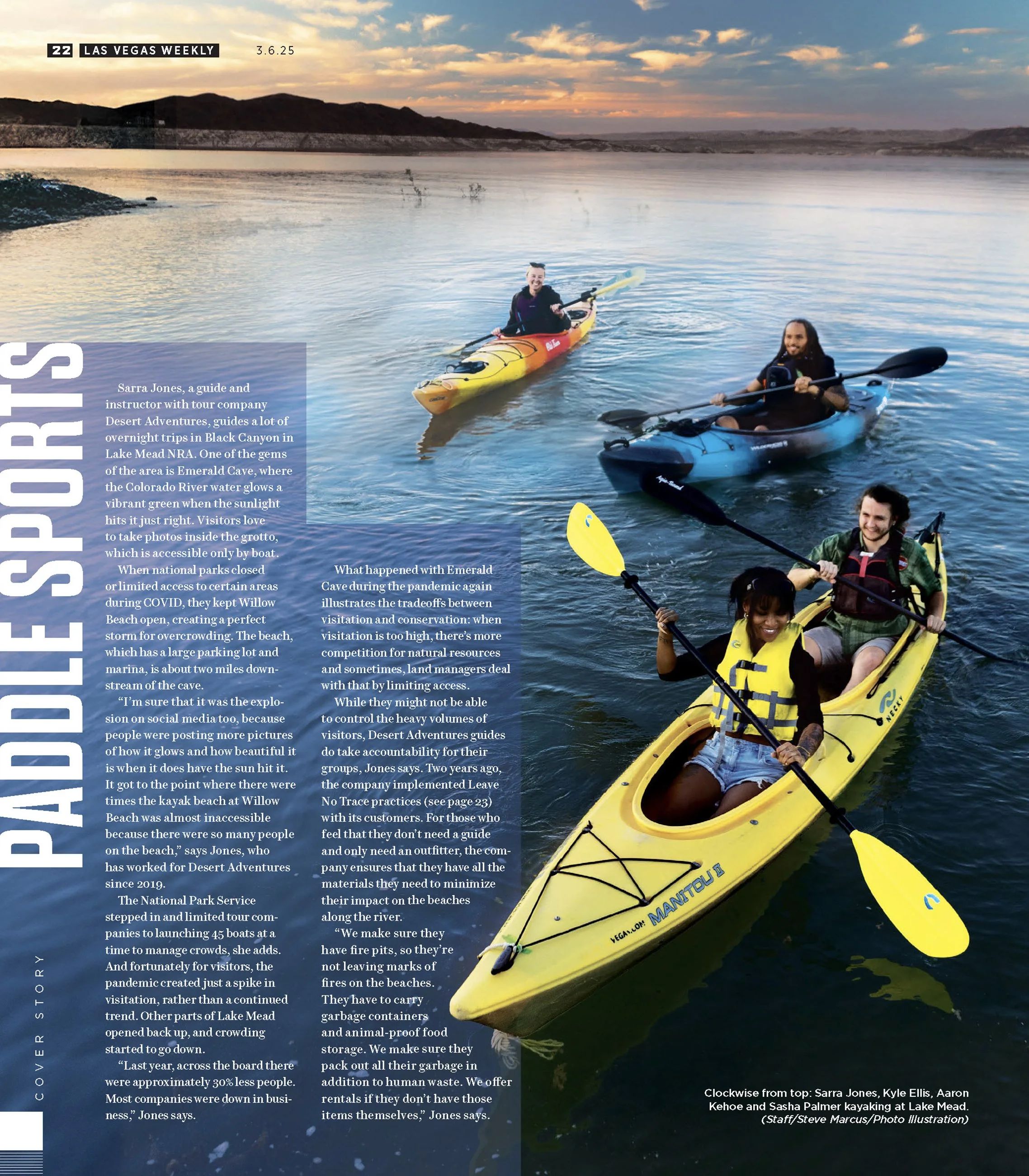
Due to various circumstances, sometimes the photos don’t end up how I had imagined they would. Here, for example, we could not get all the boaters together properly in the small sunset window since we were wrestling with nature. I used four or five photos that the photographer took from this shoot and I manipulated them into one image to meet the needs that the page layout required.
As you can see, creating a package like this requires combining multiple elements—something that takes teamwork, excellent time management, and skill to execute successfully.


