CLIENT WORK
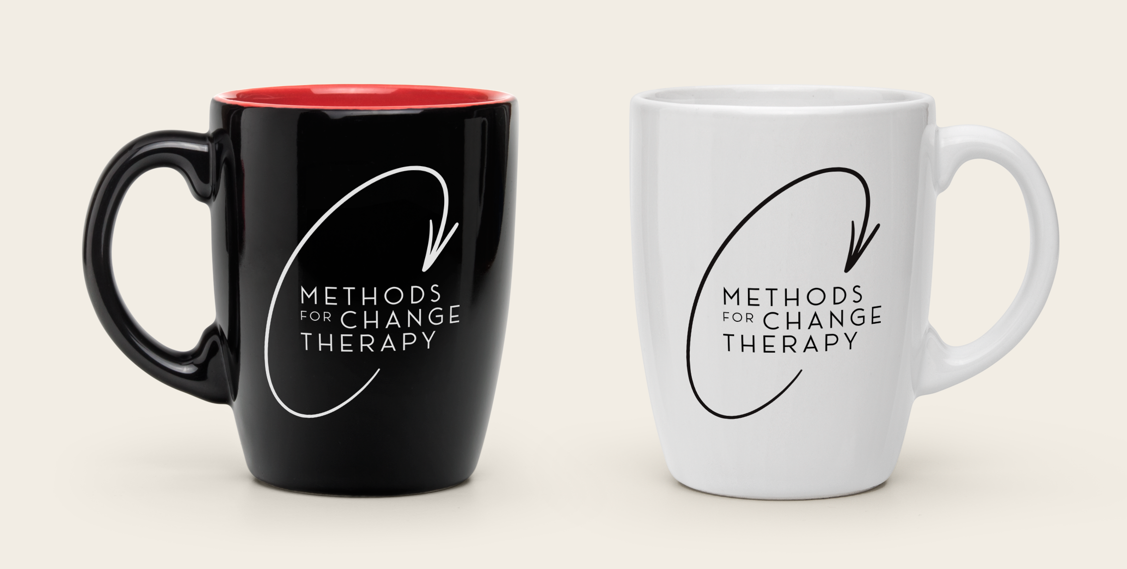
METHODS FOR CHANGE THERAPY
This logo was designed for a client’s LENS neurofeedback therapy practice. The goal was to create a visual identity that reflects growth, direction, and positive transformation, the core outcomes of this form of therapy. The upward arrow symbolizes progress and improvement, beginning at “Therapy” and guiding the viewer toward “Methods for Change,” representing the client’s philosophy of continuous personal development and empowerment.


Photography by Norma Jean Ortega
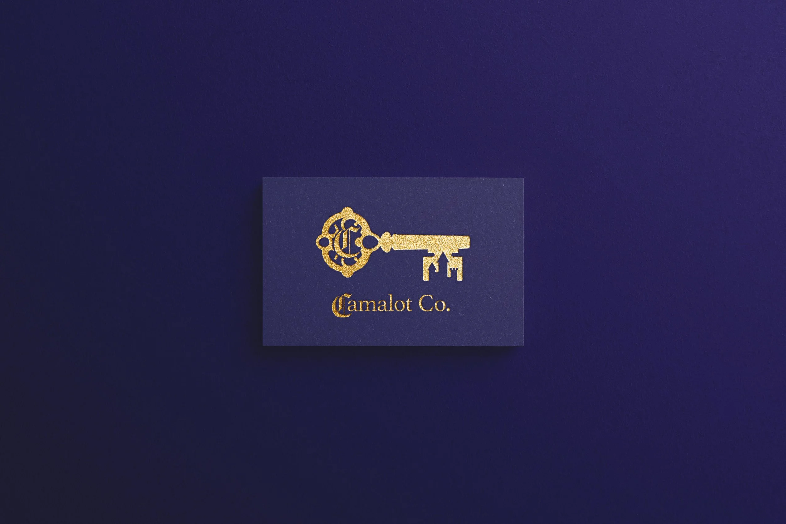
CAMALOT CO.
Logo for Camalot Co., a Nevada-based consultancy advancing public policy through creative communications. The client's name, a nod to Camelot, was an invitation to lean into medieval visual language. The mark combines an ornate key and a castle, with the key doing double duty: a callback to the theme and a symbol of the client herself as the key to unlocking her clients' communications.
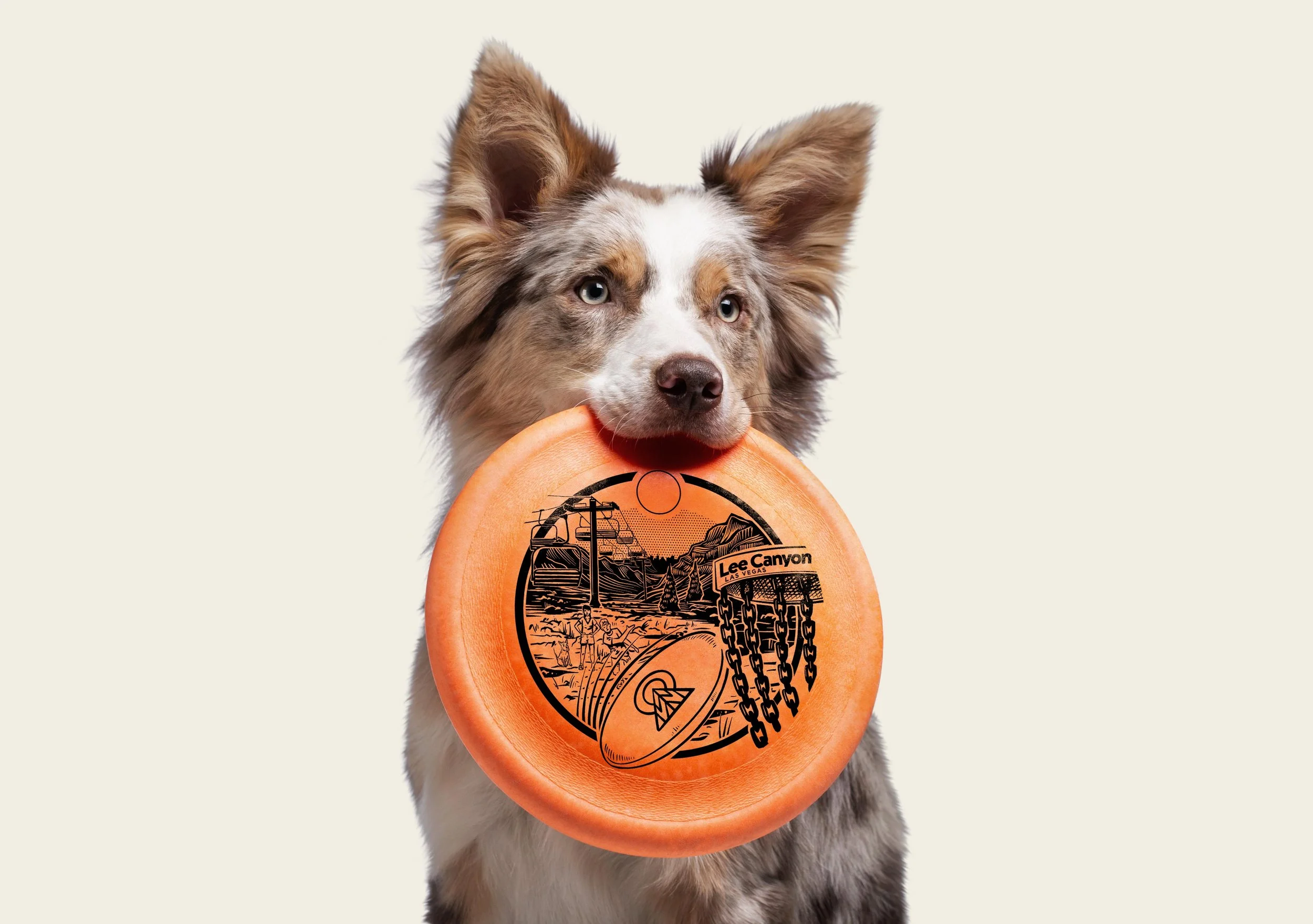
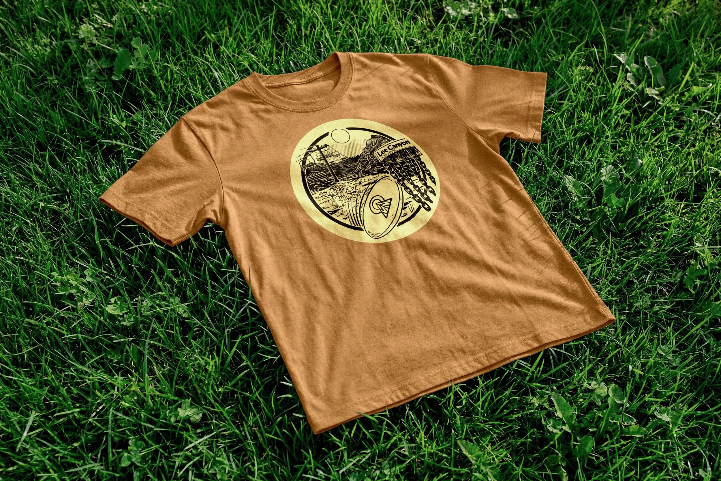
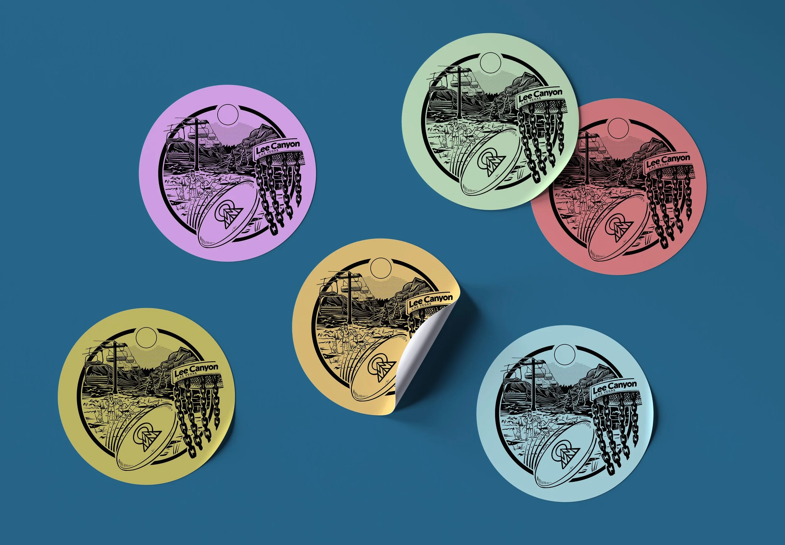
Lee Canyon brought me in to design their spring season launch illustration. The kind of piece that actually gets used. It ended up on frisbees, shirts, and stickers handed out to mark the occasion.
LEE CANYON