
The Las Vegas Weekly is one of Vegas' most recognizable and longest-running local magazines. 50,000 copies printed every week and an active social media presence reaching even more. Covering everything worth knowing about Las Vegas. I joined as a designer and grew into the Senior Designer role over eight and a half years and 400 plus issues, shaping how it looked and felt as it hit the newsstands. Here's how that work got made.
Design isn't something I picked up. It's something I grew into over a lifetime. The talent was always there early but talent alone doesn't make great work. Years of real deadlines, real clients, and real pressure turned it into something I can depend on. What you see here is the culmination of all of it.
The Skills
◀︎
Design
Brand identity, visual story telling, publication design, marketing collateral, typography, infographics, digital banners, photo retouching, and creative concepting.
Technical
Adobe Creative Suite, Figma, Canva, Microsoft Office, prepress, color management, and file prep for print and digital.
Collaboration
Cross-functional teamwork, vendor coordination, client communication, and stakeholder presentations.
Project Management
Multi-project scheduling, production oversight, asset archiving, and quality assurance.
◀︎
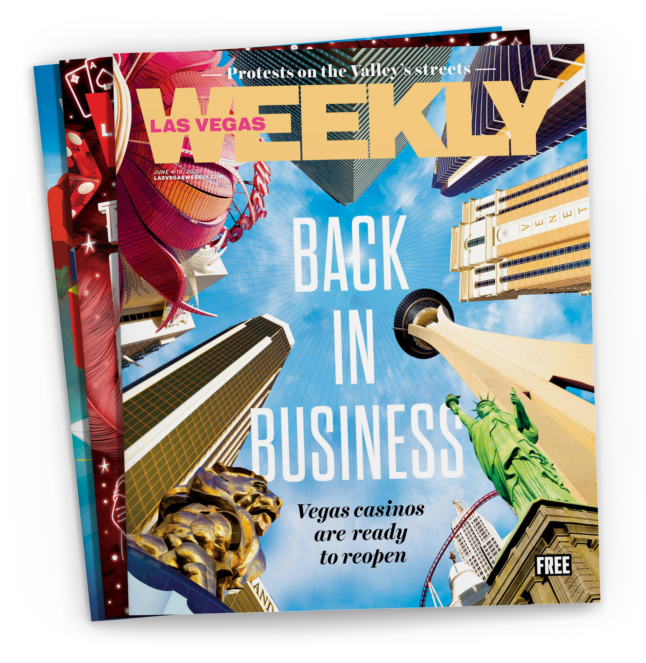
Las Vegas was back. I wanted that feeling on the cover, the awe a tourist feels looking up at these buildings for the first time. I directed the photographer to walk the Strip and shoot each property from below. Then I composited everything into one image that felt as big as the moment.
◀︎
▶︎
The Process
CONCEPT
Brainstorming and sketching to establish a visual roadmap before production begins.
DIRECTION
Coordinating logistics and image selection for maximum storytelling impact.
DESIGN
Crafting competitive covers and cohesive interior layouts that command attention.
PRODUCTION
Rigorous pre-press proofing to ensure technical accuracy and flawless print quality.
AMPLIFICATION
Extending the life of every project through strategic social media adaptation.
Collaboration
The Best of Vegas 70s edition was a full team effort and the cover set the tone for all of it. I built a real physical logo out of disc mirrors, directed the shoot around it, and handled almost all the post production and typography myself. This visual became the foundation everything else built on.
Design and marketing made sure it carried consistently from the page to the party. Same palette, same energy, same era. The events team then took it to the floor, working with vendors to bring the whole concept to life.
The biggest night of our year built on one shared vision and everyone doing their part to make it unforgettable.


Clarity, Designed
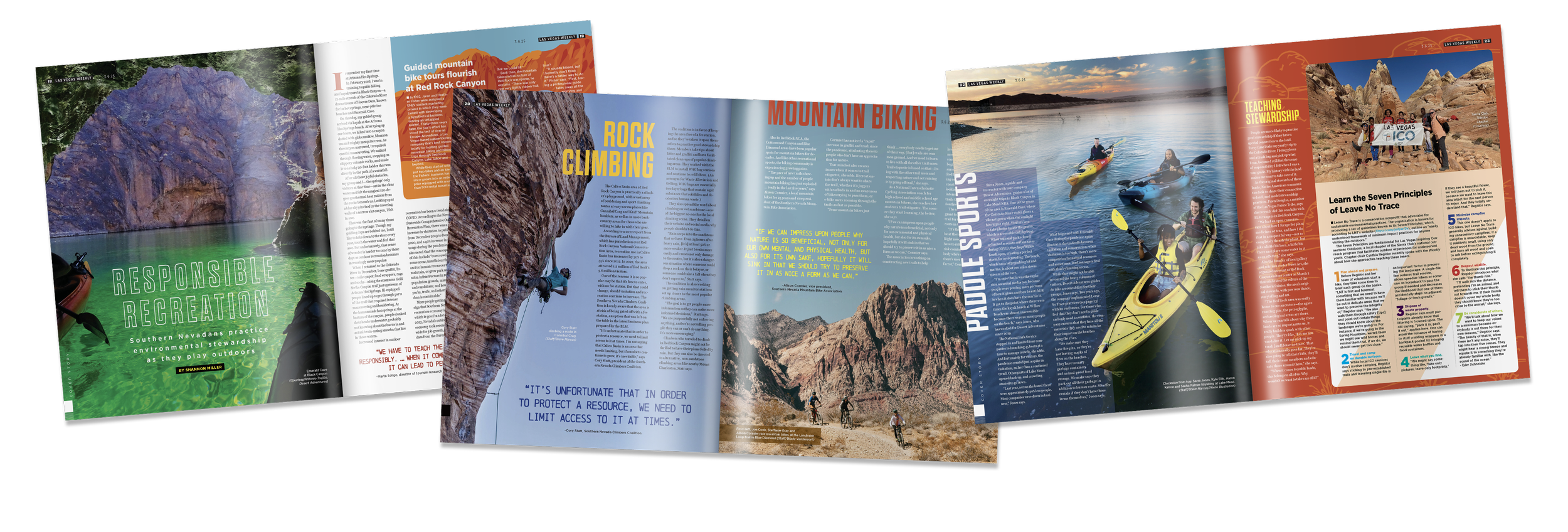
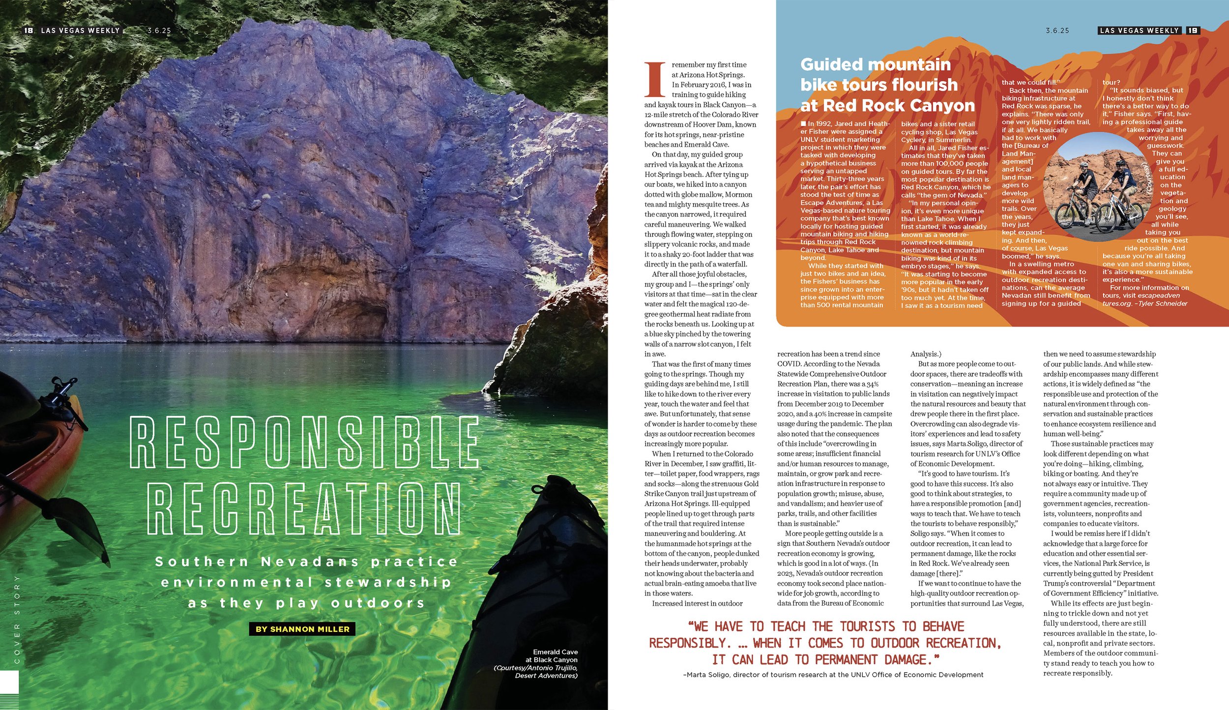
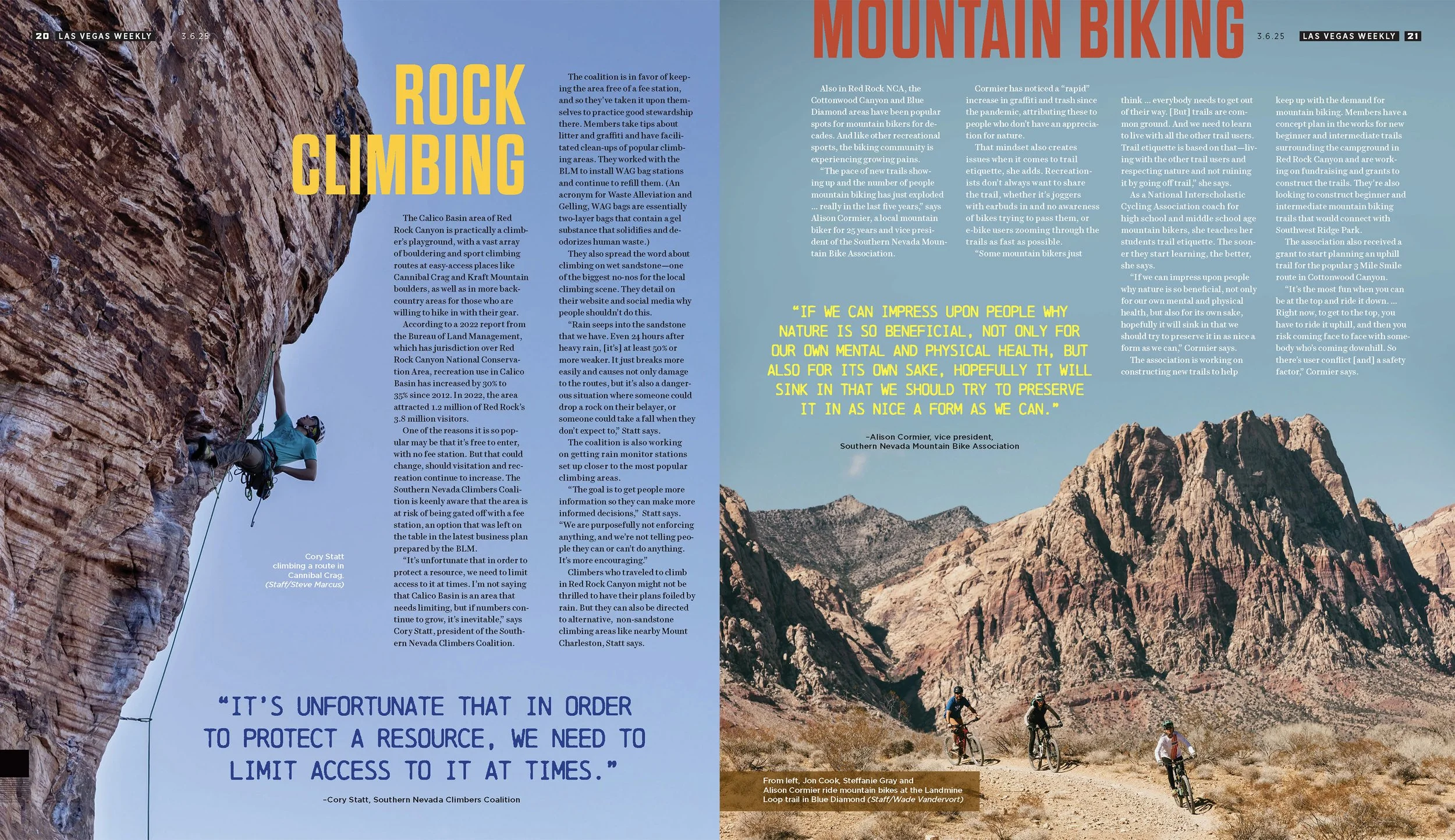
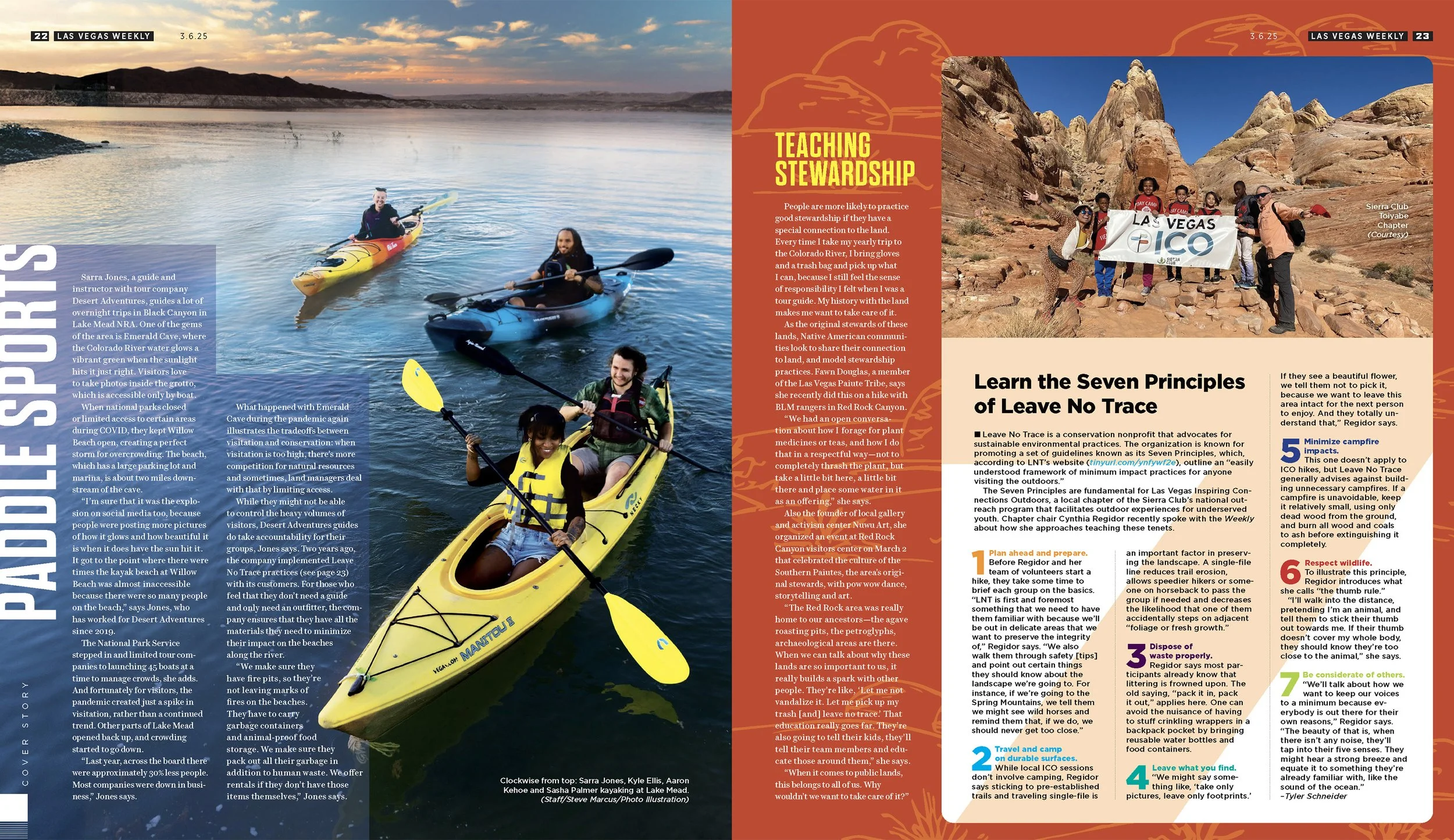
Most of the time, the content isn't yours. Someone hands you a calendar of events, a list of award winners, a wall of restaurant copy, or in this case, how to rock climb as a beginner, and my job is to make it worth reading. Hierarchy, pacing, the way your eye moves through a page, those are all deliberate choices, and they either serve the reader or they don't. Knowing how to take someone else's raw material and make it something people actually want to look at is one of the most underrated skills in design.
Adaptability
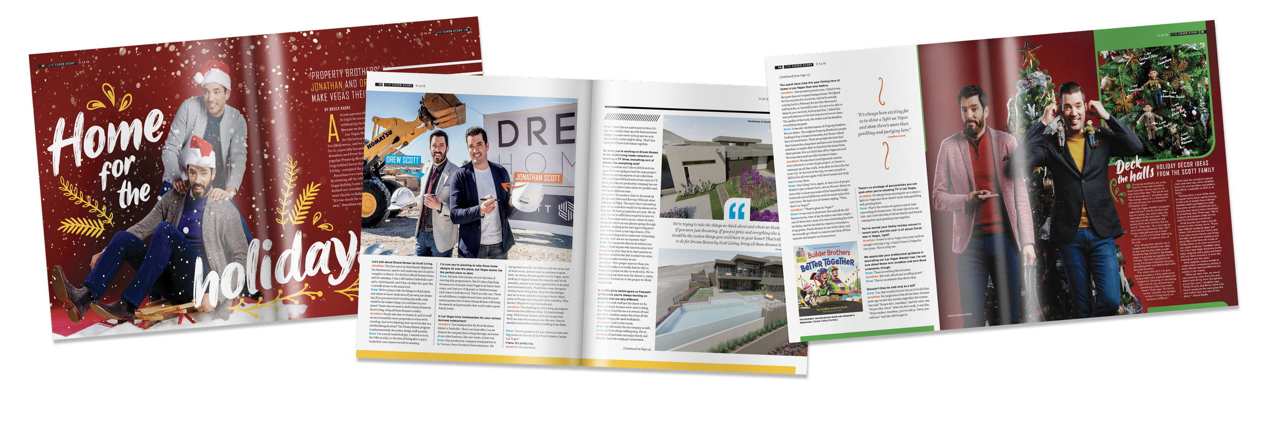
The writing team spent months securing an interview and photo shoot with the Property Brothers. The location scouted and vision locked, the location's PR signed off on our request.
Then 24 hours before the shoot, they called and pulled their approval. The compromised alternative they offered wasn't worth taking.
Canceling on the Property Brothers wasn't an option. Too much time, too many people, too much riding on it. So I pivoted with a Christmas tree themed shoot in our studio. It will be controlled, achievable, and actually perfect for the holiday issue. I went out that same day, bought the tree from Lowes, sourced all the props. With my team, we set everything up before the Property Brothers' crew arrived the next morning.
The shoot happened and the photos were perfect. Anyone who picked up the magazine was none the wiser.

Deciding Taste
You're not just picking things, you're making arguments. Every frame, every typeface, every color is a position. The photo sets an expectation and the type either confirms it or it doesn't. The color tells the reader where they are before they've consciously processed anything. When it all clicks, you know it before you can explain why.
At the end of the day the work is all we have. Not the titles, not the accolades, the actual making of things. I've never lost the enjoyment of that. Every project is a chance to solve something, make something, leave something behind that didn't exist before.
Having Fun with It
Click any button for
more Las Vegas Weekly
ACCOLADES
Awards that I’ve won while at the Las Vegas Weekly magazine
Nevada Press Foundation
2023 Outstanding Graphic Designer
2019 Best Graphic Designer

Association of Alternative Newsweeklies
2025 Editorial Layout/First Place
2024, 2019 Editorial Layout/Third Place
2018 Cover Design/First Place
Best of the West Journalism Contest
2020 Best Page Design/Second Place
Cover Photography Credit: “Fresh Sounds” Mikayla Whitmore, “The Great Outdoors, The Property Brothers, Dim Sum, Aces” Wade Vandervort