
The 19th
I want to be a part of the 19th. I have an innate drive to help visualize stories, and I thrive in an editorial environment. How information is presented matters deeply to me. I light up when a great story comes to life with equally great visuals, and that’s what I want to bring to the organization. The 19th's mission to center women, LGBTQ+ people and other underserved communities aligns closely with my own values, and I hope that comes through in the work below.
WORK AT THE LAS VEGAS WEEKLY MAGAZINE
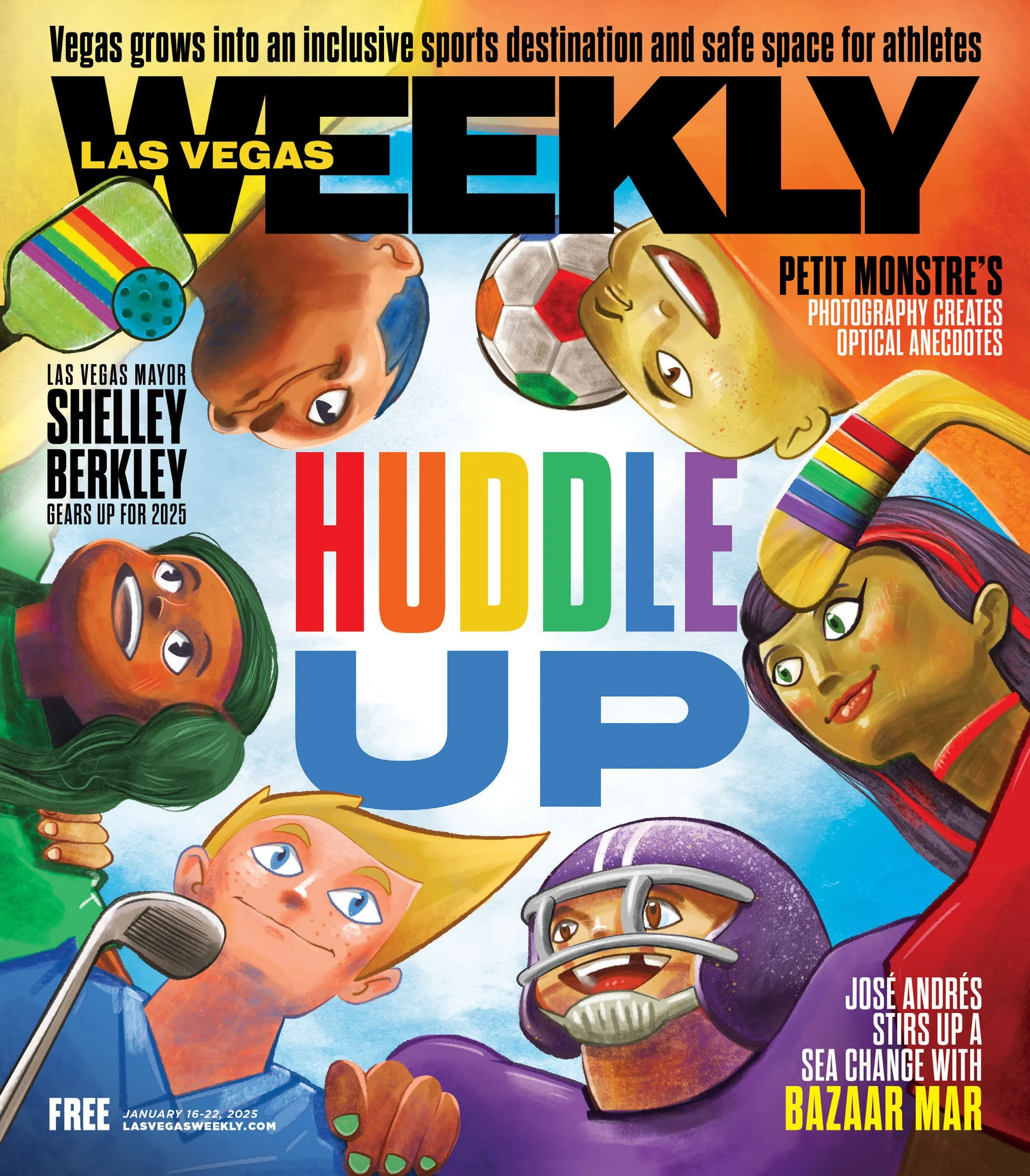
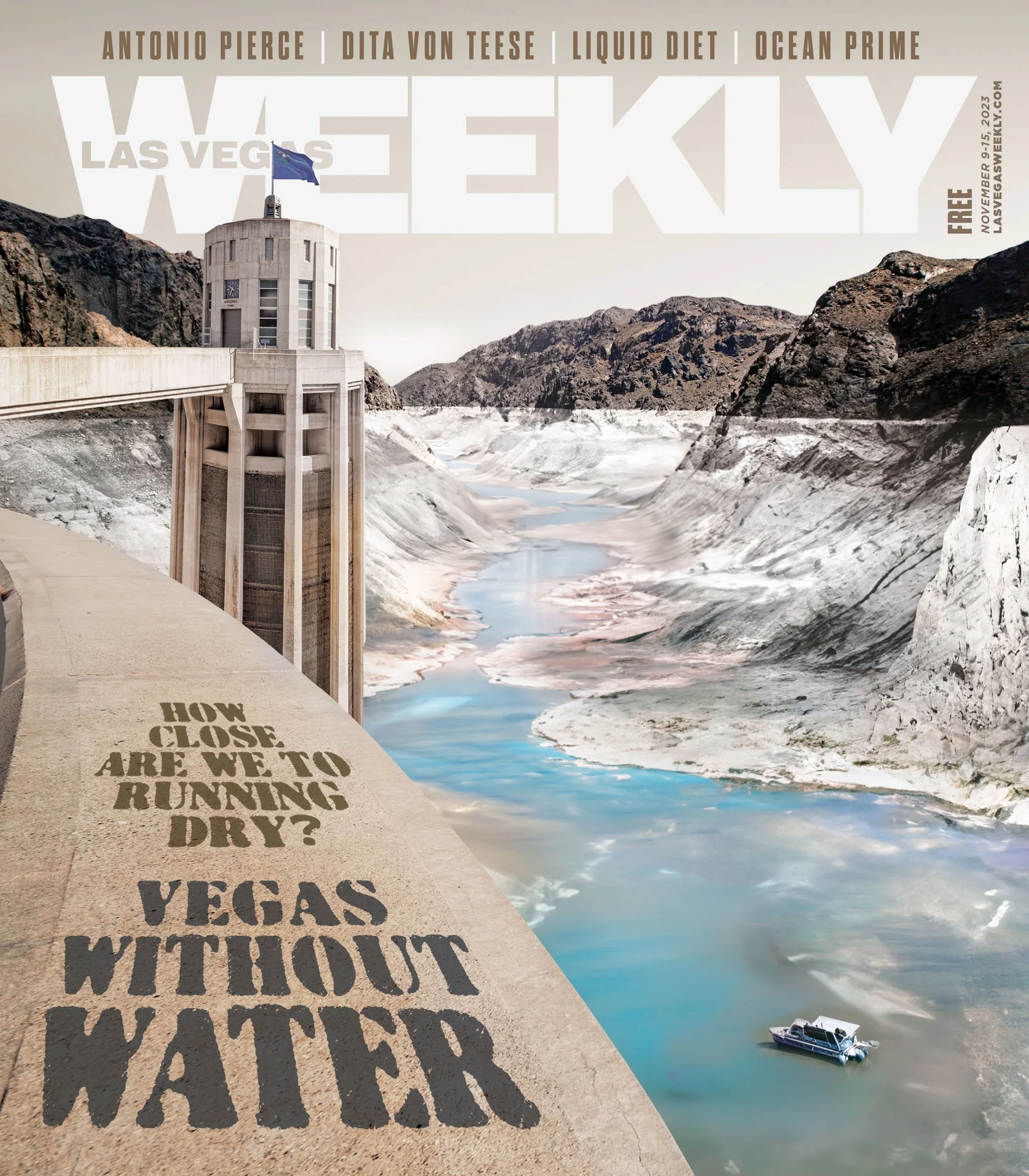
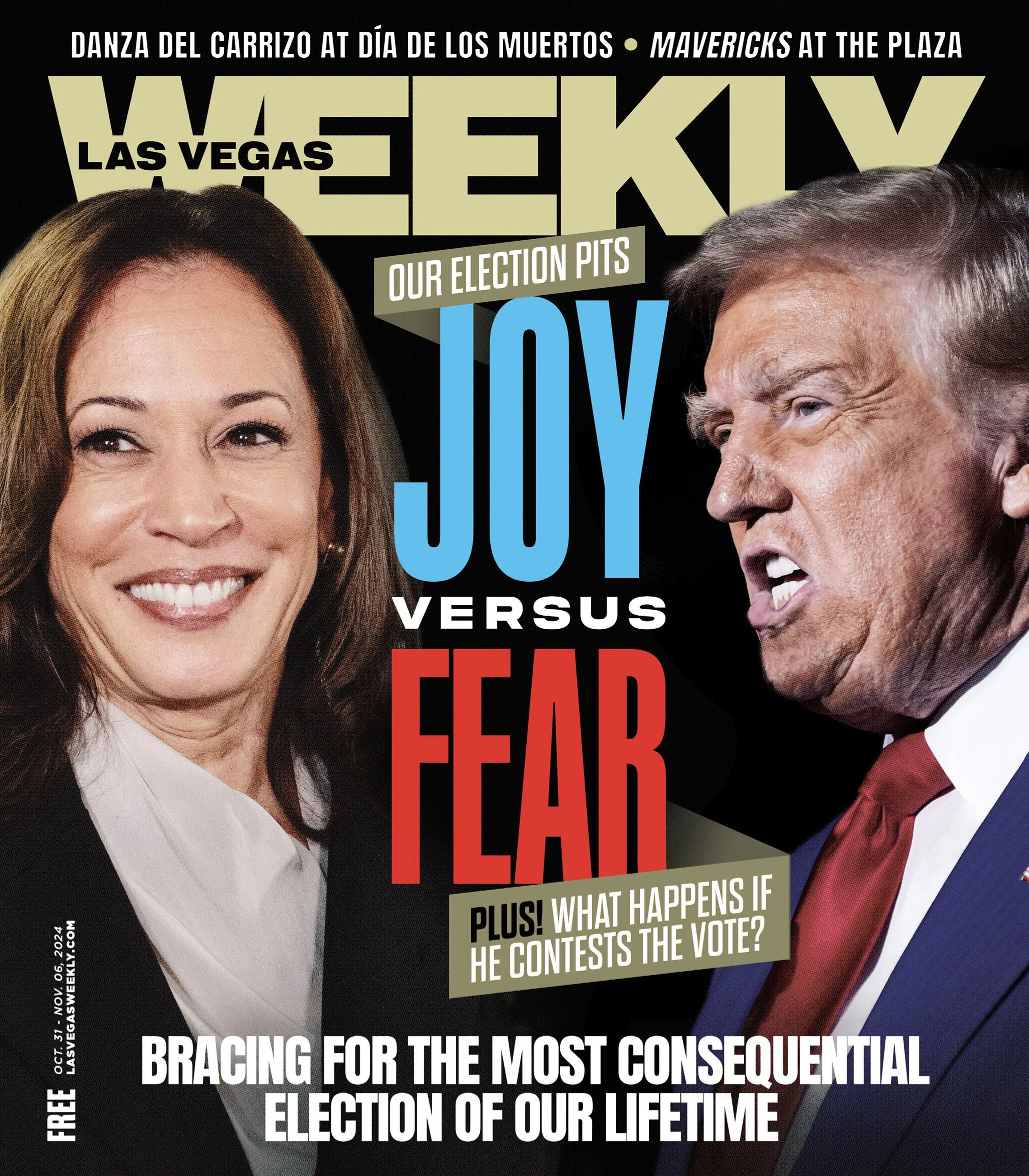
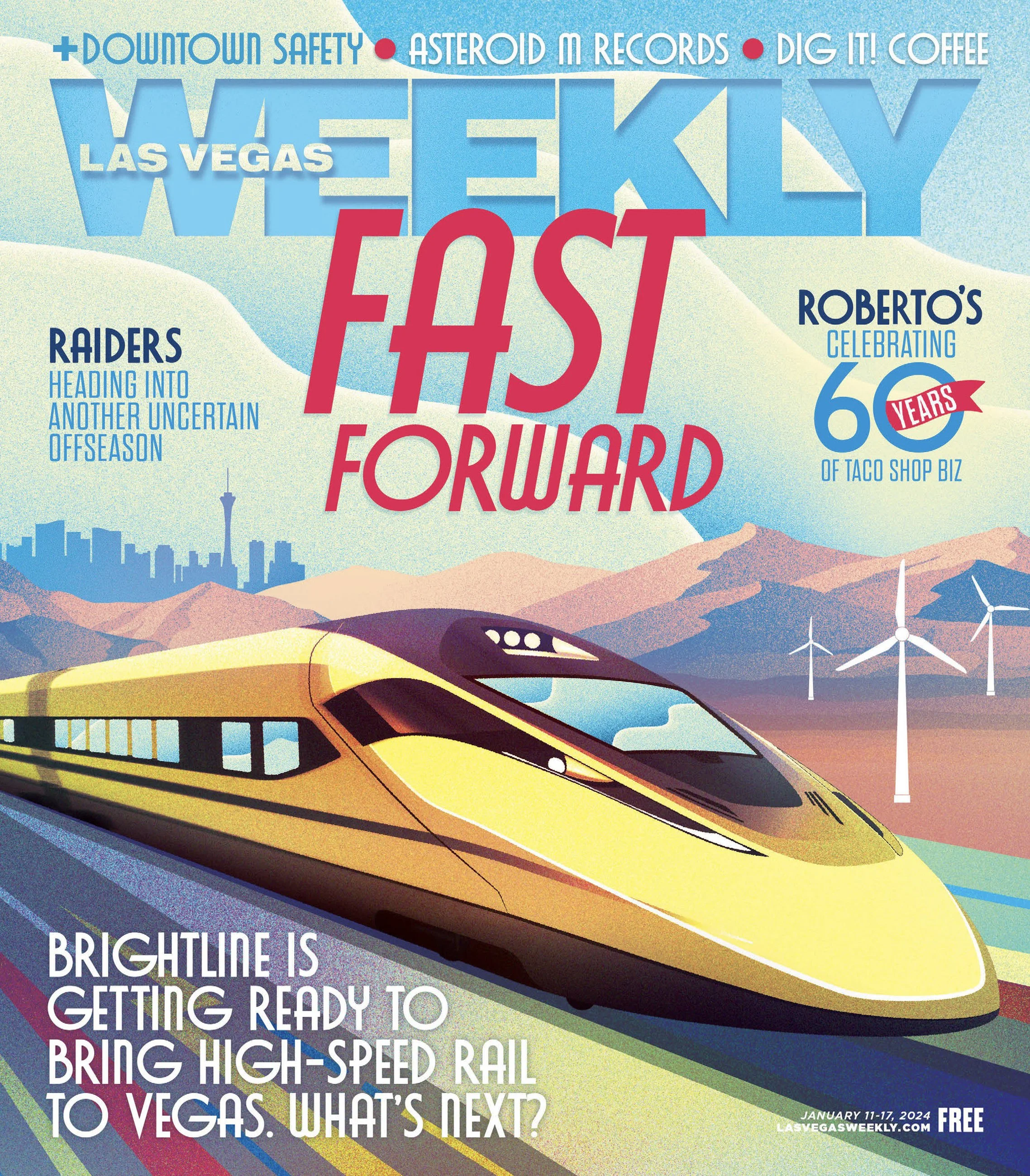
My visual identity stems from a traditional background in painting and drawing. I move fluidly between artistic styles, shaping each piece to match whatever tone a story needs, whether that's creating graphics from various sources, directing photographers and illustrators, or physically illustrating the visual myself. First and foremost, that means reading the story brief and talking with writers about the story's intent. That adaptability has made a real difference when building packages as part of a team.
● Adobe Creative Suite (Photoshop, Illustrator, InDesign, Lightroom) ● Figma ● Procreate
● Sourcing Photos ● Editorial Illustration ● Art Directing ● Typography & Accessibility ● Digital & Print Preparations ● Collaboration with Editors and Reporters ● Self Directed
The bulk of my editorial experience comes from eight and a half years at the Las Vegas Weekly. A city magazine that publishes 60,000 copies a week to Las Vegas and parts of California, Utah, and Arizona.The magazine covers the city's arts, entertainment and news, with a real commitment to spotlighting BIPOC and LGBTQ+ communities. As a weekly magazine, quick turnarounds on graphic work were imperative. I started as a graphic designer and worked my way up to senior designer. In that time, I created thousands of editorial images and page layouts.
VISUAL IDENTITY

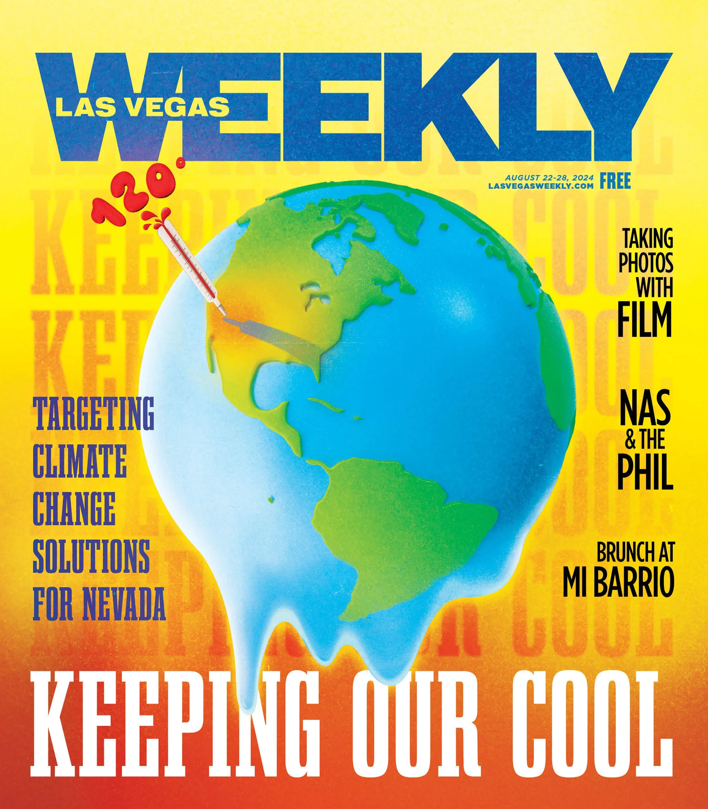
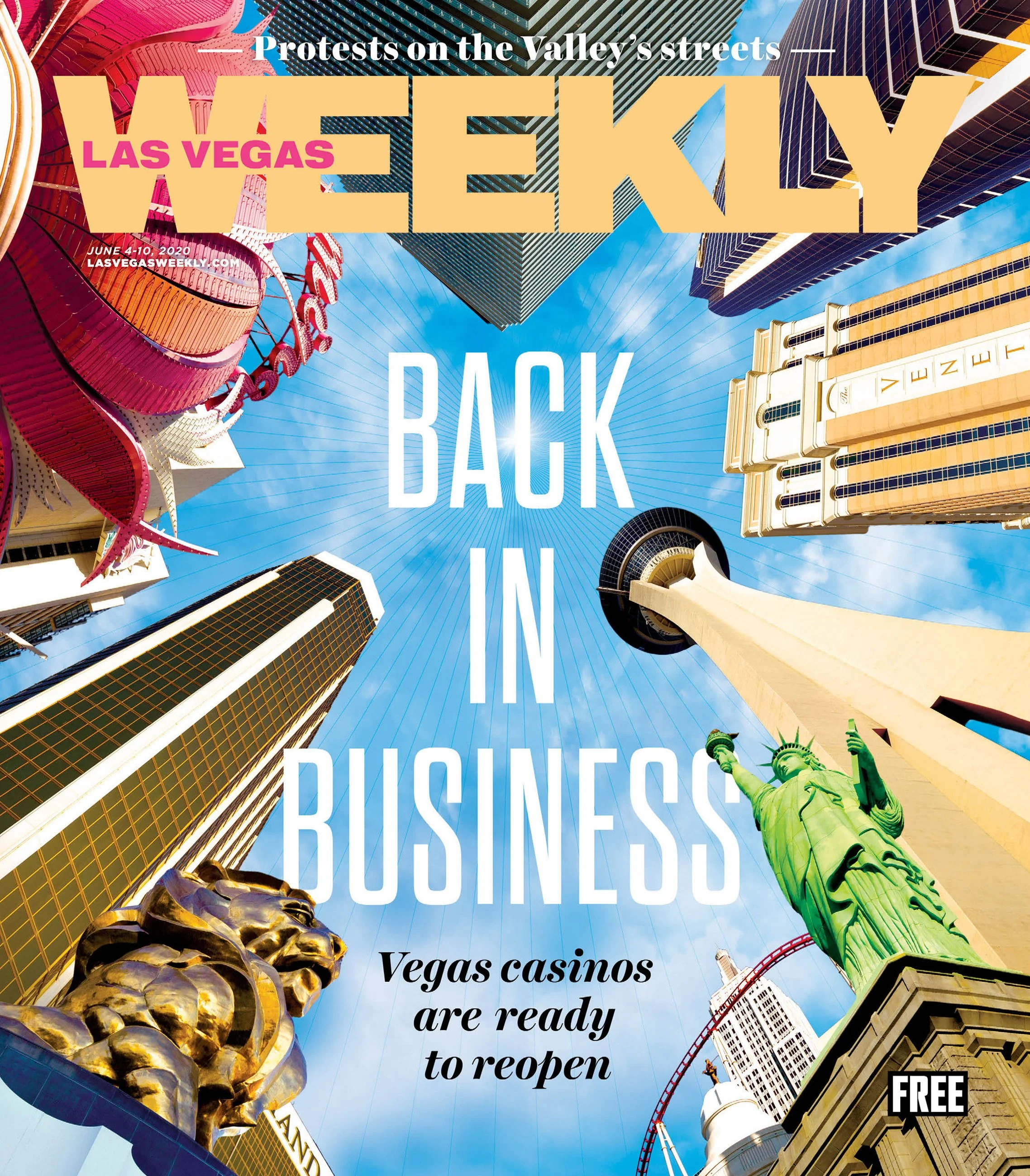
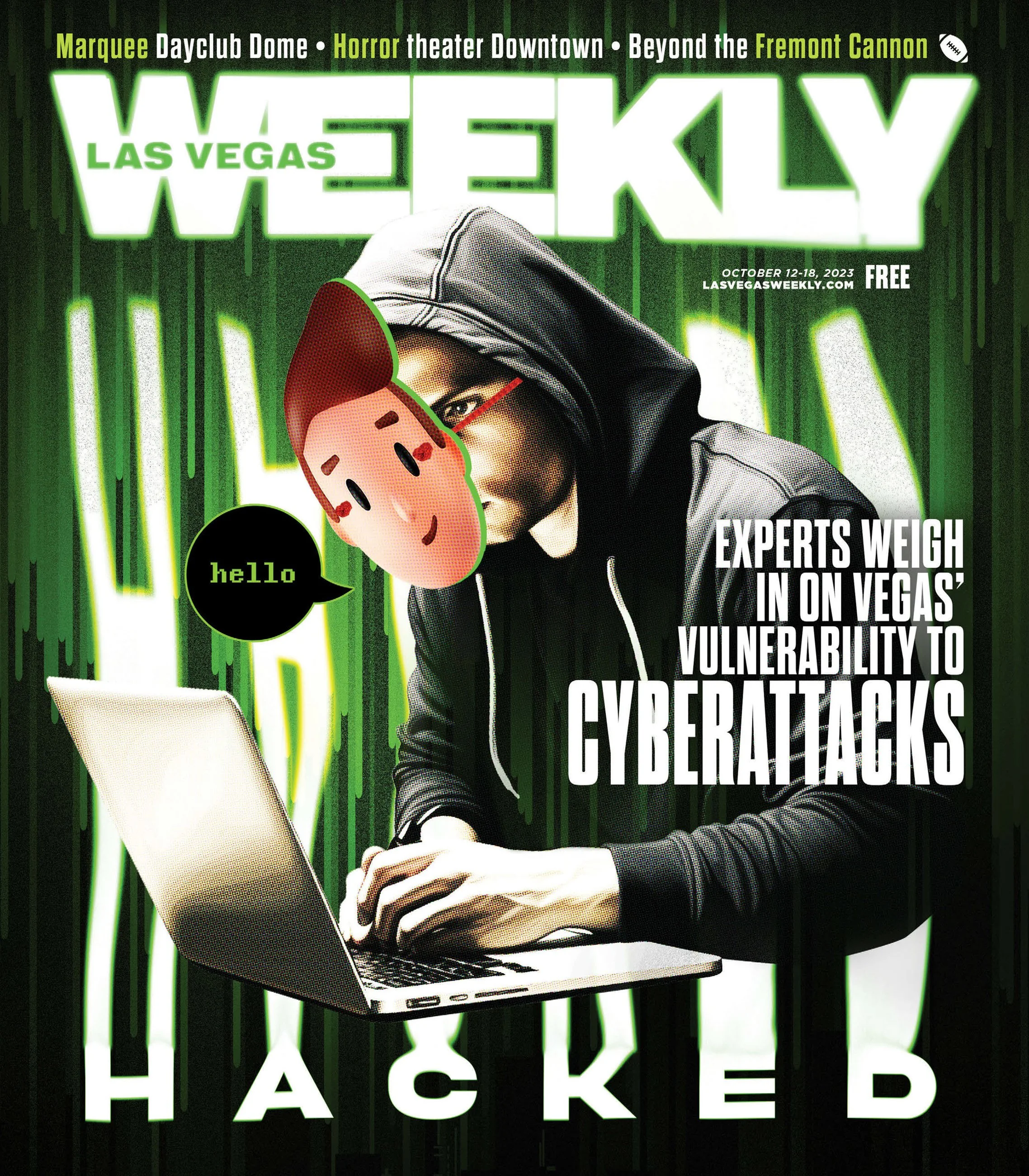
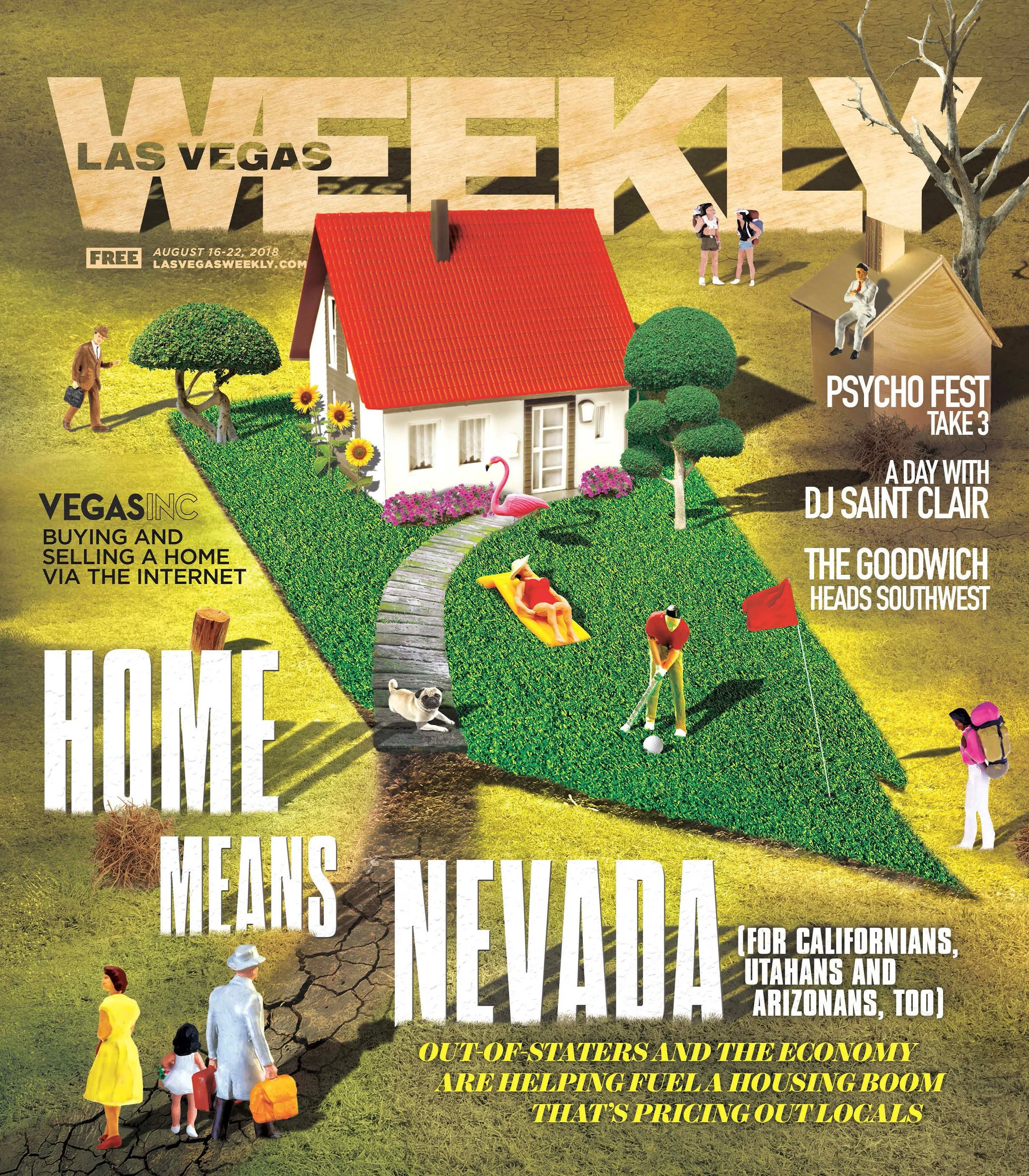
RAPID-TURNAROUND
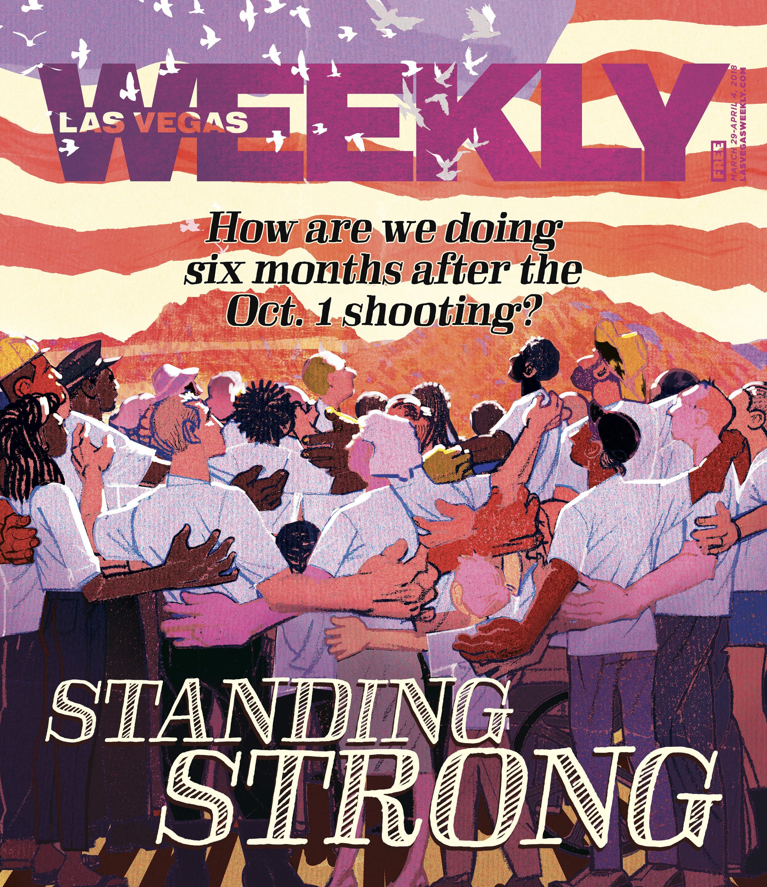
Oct. 1, 2017 is remembered as the darkest day in Las Vegas history. It remains the deadliest mass shooting in modern US history, when a gunman opened fire on the Route 91 Harvest music festival, killing 60 people and injuring hundreds more.
This event happened on a Sunday night, our magazine prints on Tuesday morning. We had already created an issue with a completely different cover story package. That had to be put on hold for now. I was tasked to paint a unifying image to replace the previous story while the writers wrote stories about Strip unity, resilience, tributes and mourning . There were several iterations of this image before I landed on this final piece.
This shows the clearest example of my ability to pivot and produce quality work before deadline.
DEVELOPED PROJECT
Creating the art for this feature was a serious undertaking. It's a topic that I know most people have had experience with in one way or another, and I wanted to approach it in a delicate and tasteful manner but still show the serious consequences.
I worked closely with the writers to brainstorm what the cover could be. I knew I wanted to visualize the "falling down a rabbit hole" metaphor. Here I have a average joe type person getting engulfed by the algorithm and ultimately becoming radicalized.
I spent careful time choosing photos to edit for the main story, many from Shutterstock and manipulated to fit the theme. I then used unedited staff and Associated Press photos to represent real events.
EDITORIAL ILLUSTRATIONS
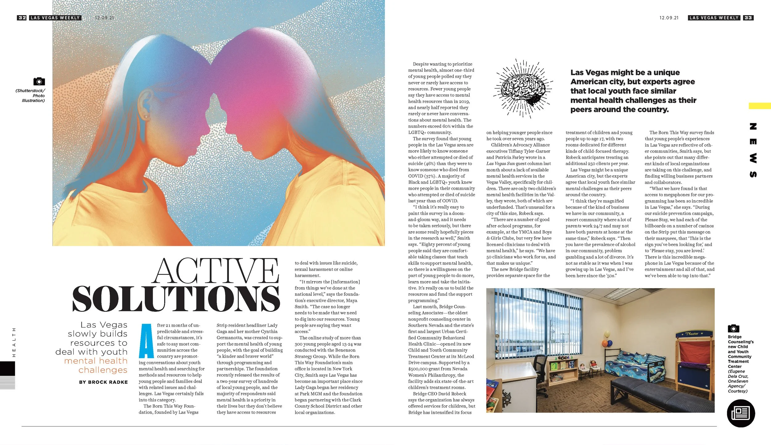
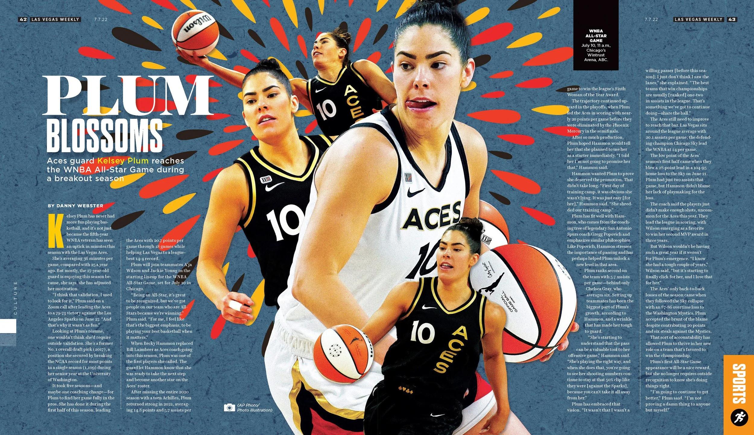
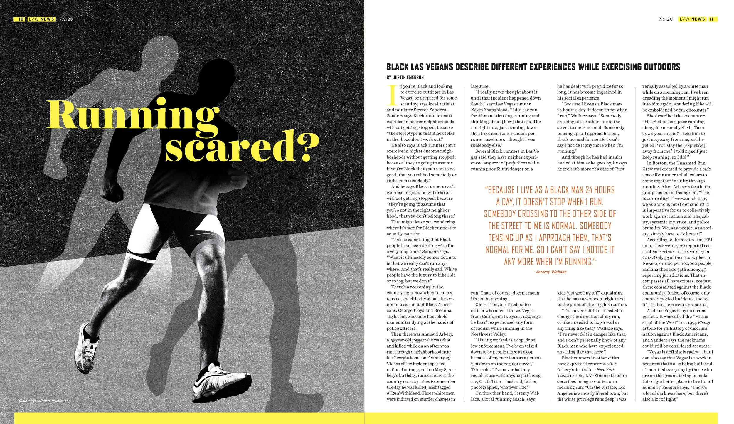
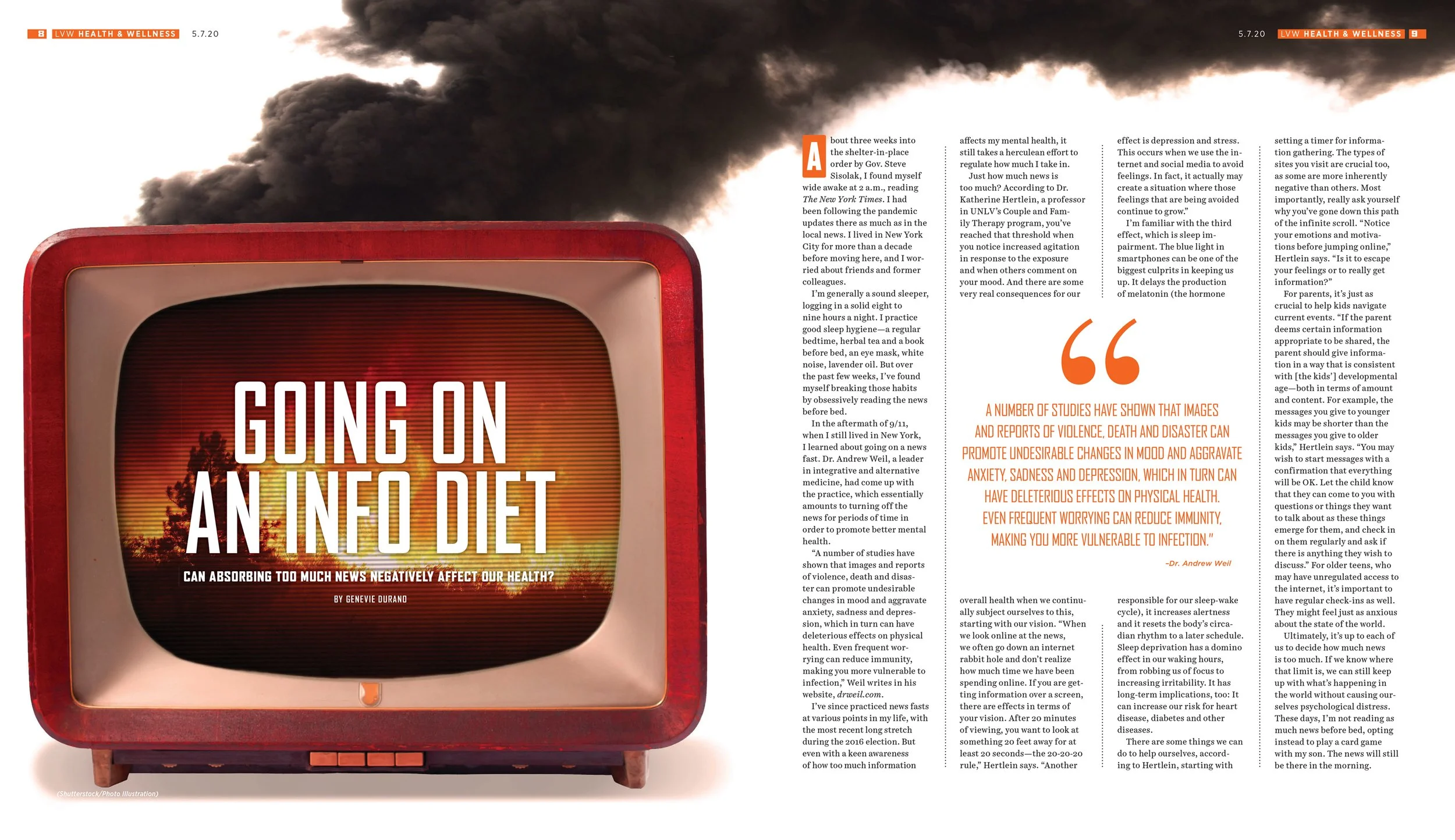
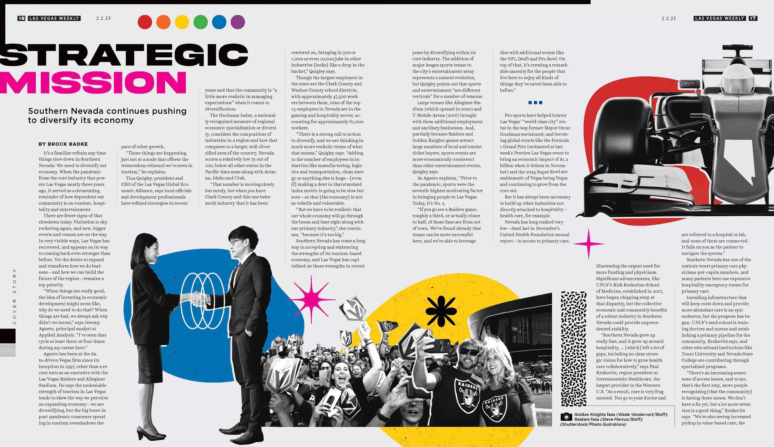
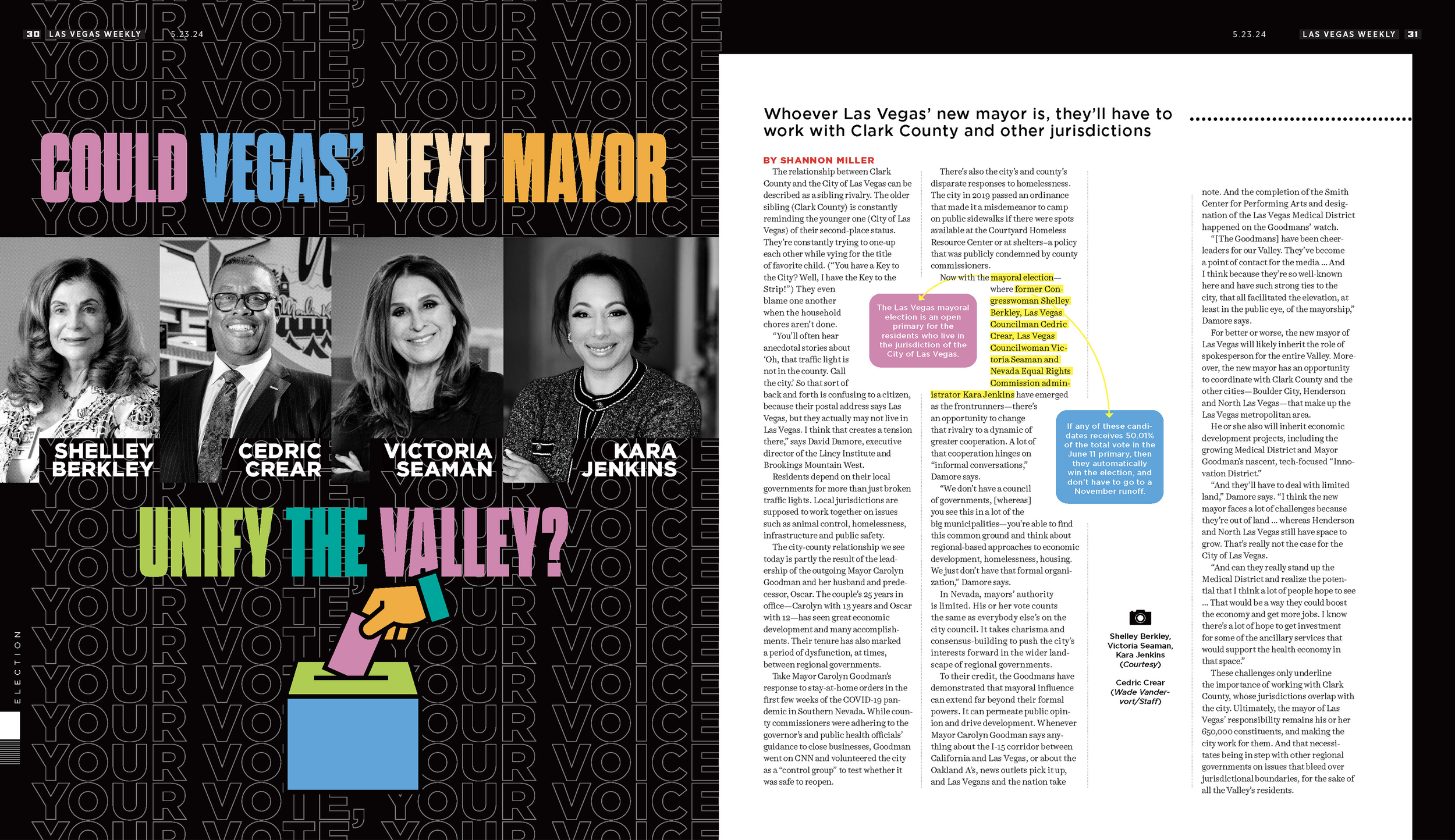
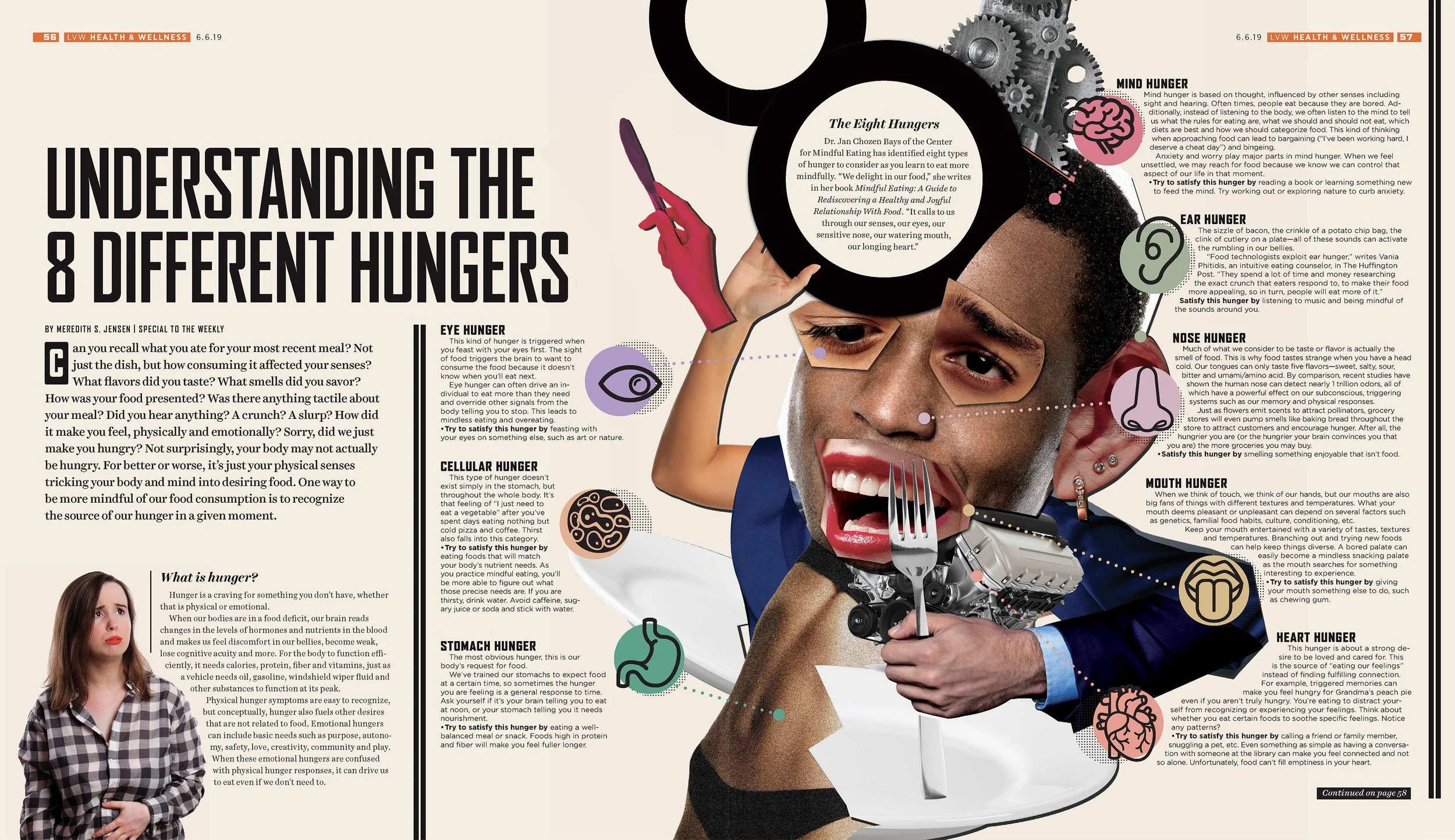
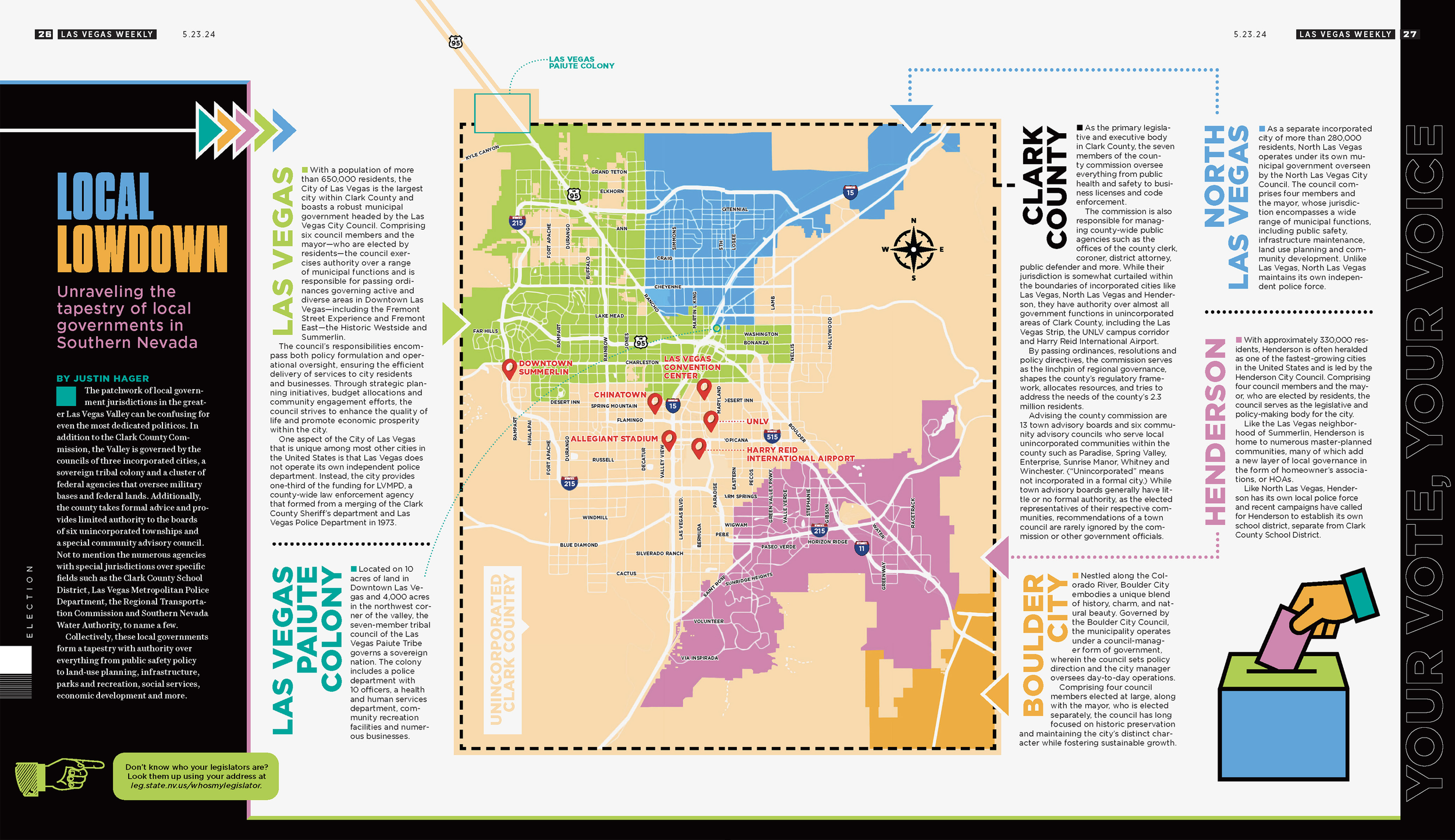
The obvious image is rarely the right one for stories with sensitive topics and no clear subject. Often, there wasn't an existing image to use at all. My role was to create visuals for stories that were complex, with no clear visual path laid out. I cherished those assignments because they asked me to create from feeling.
Below is a mix of work. Stories where I manipulated Associated Press, stock, and staff photos into something new.
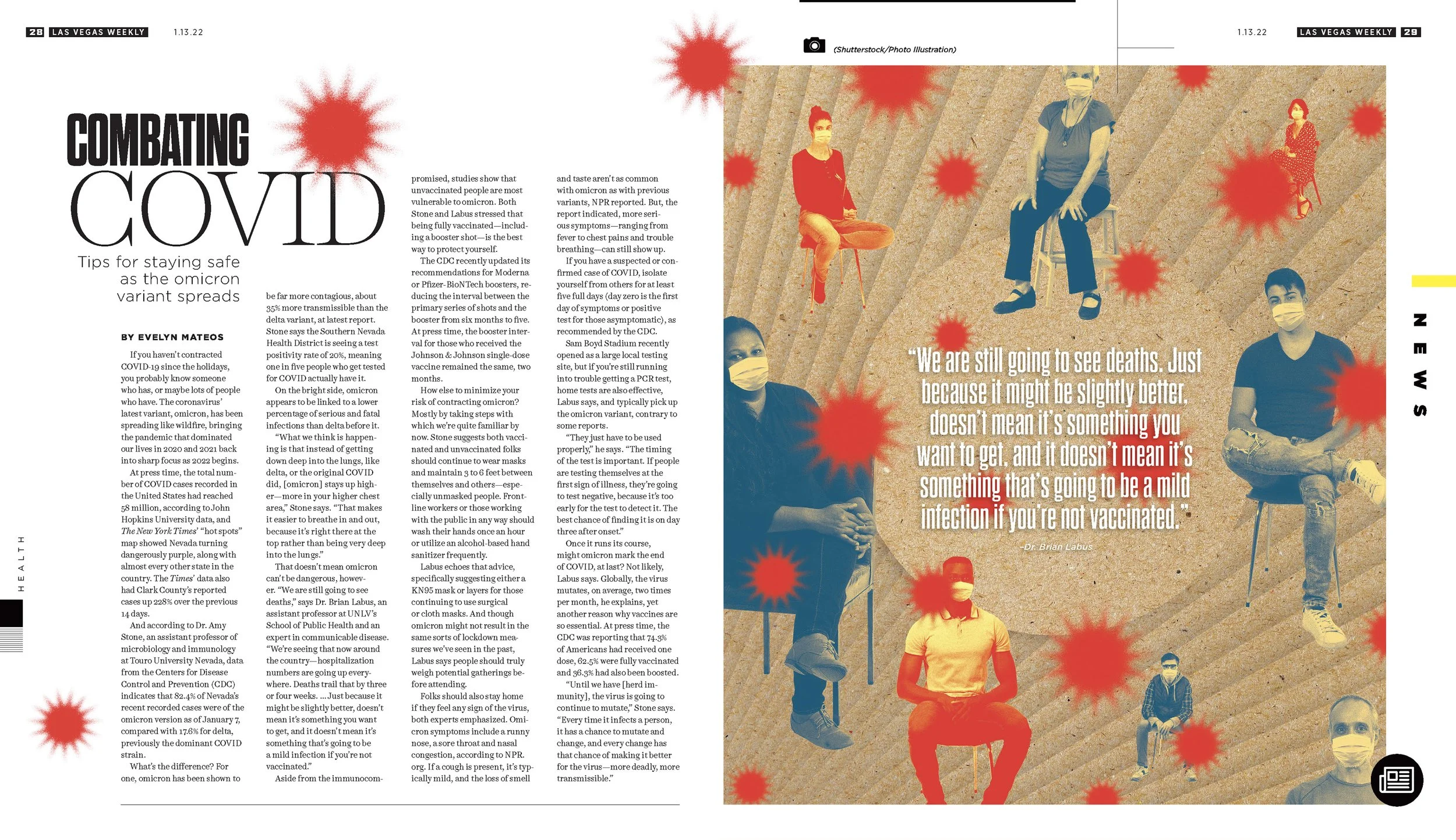
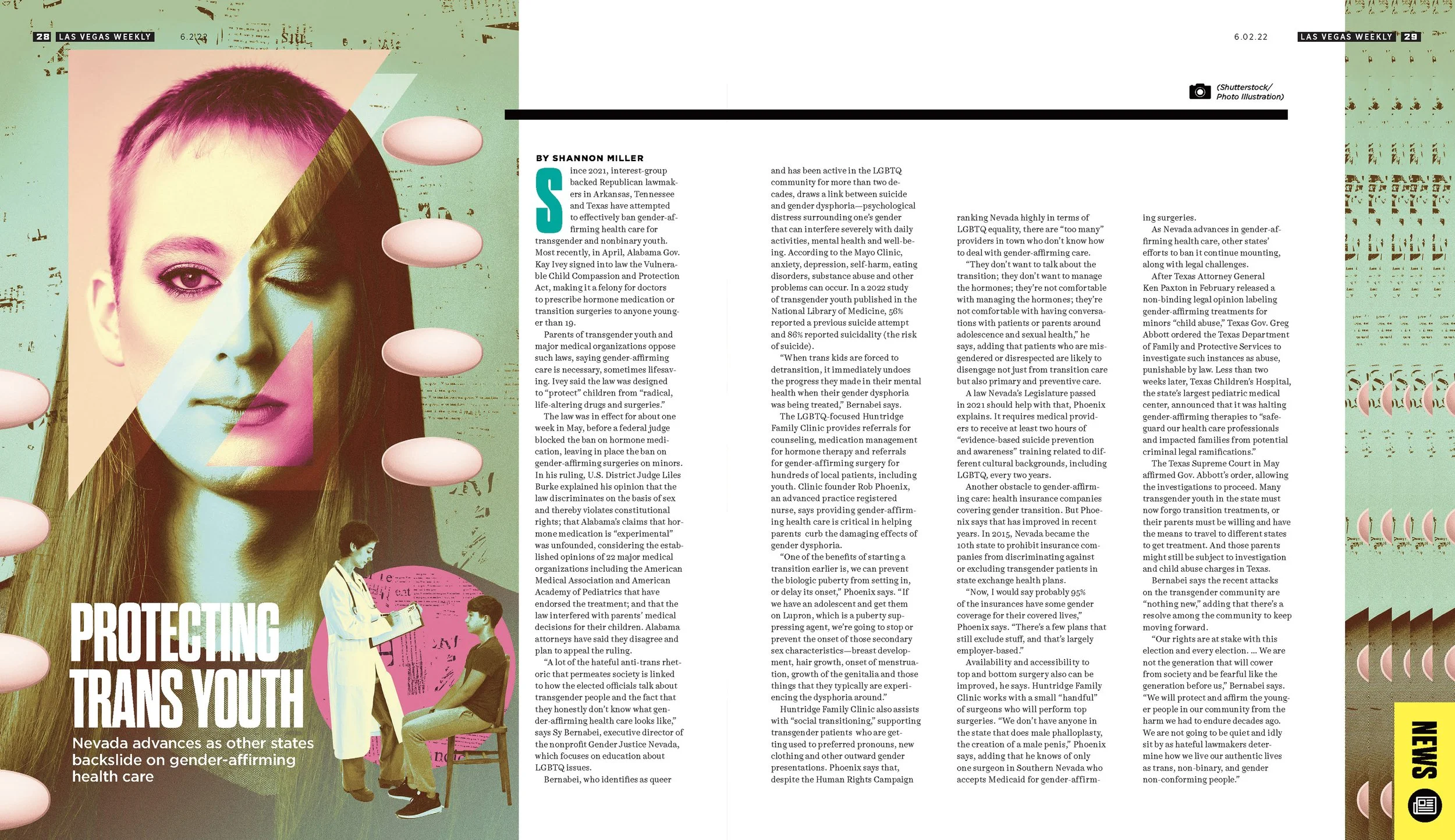
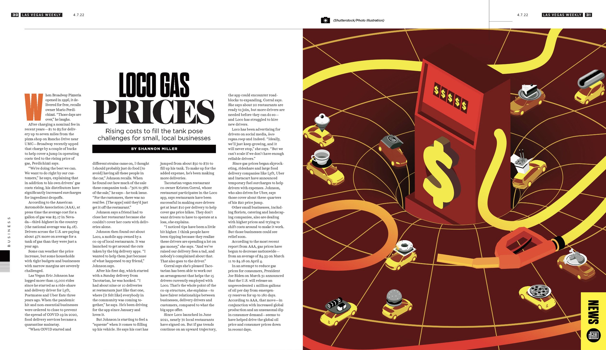
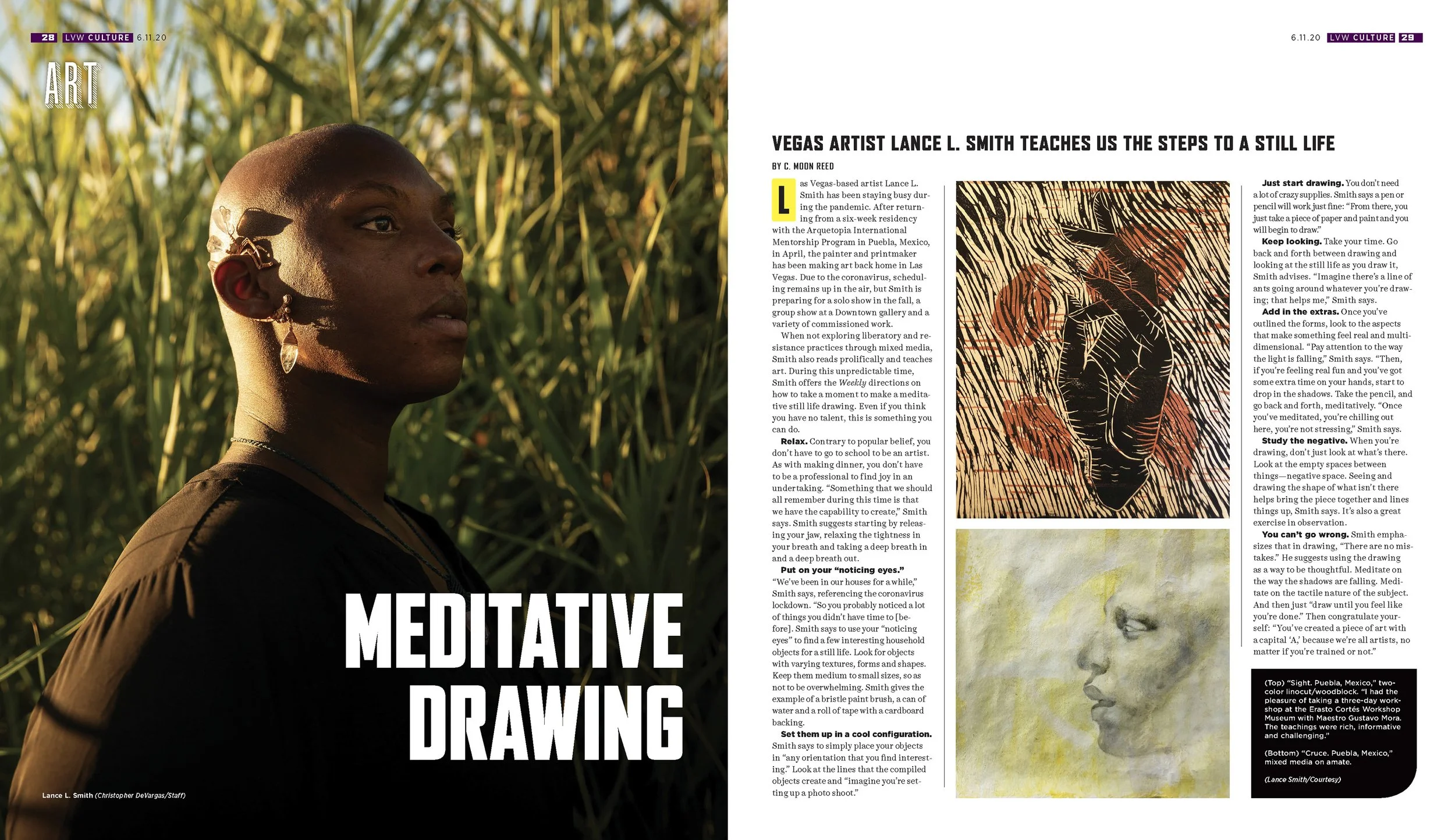


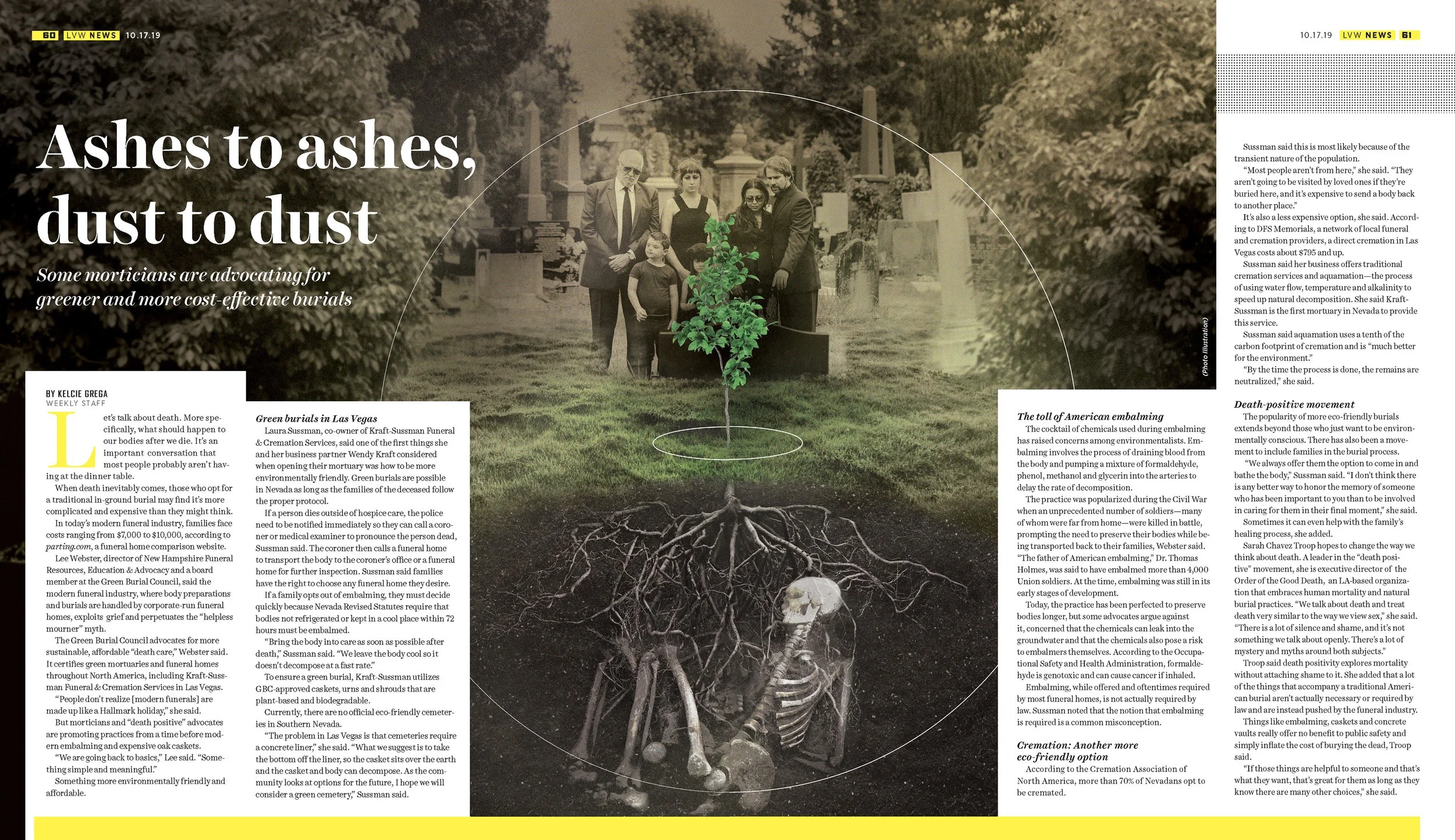

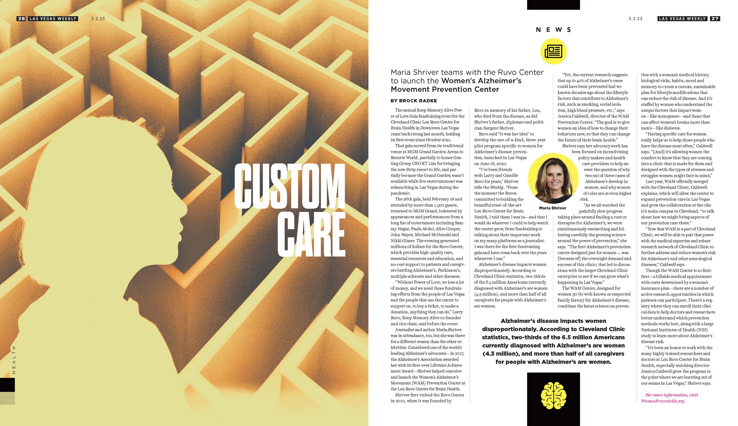
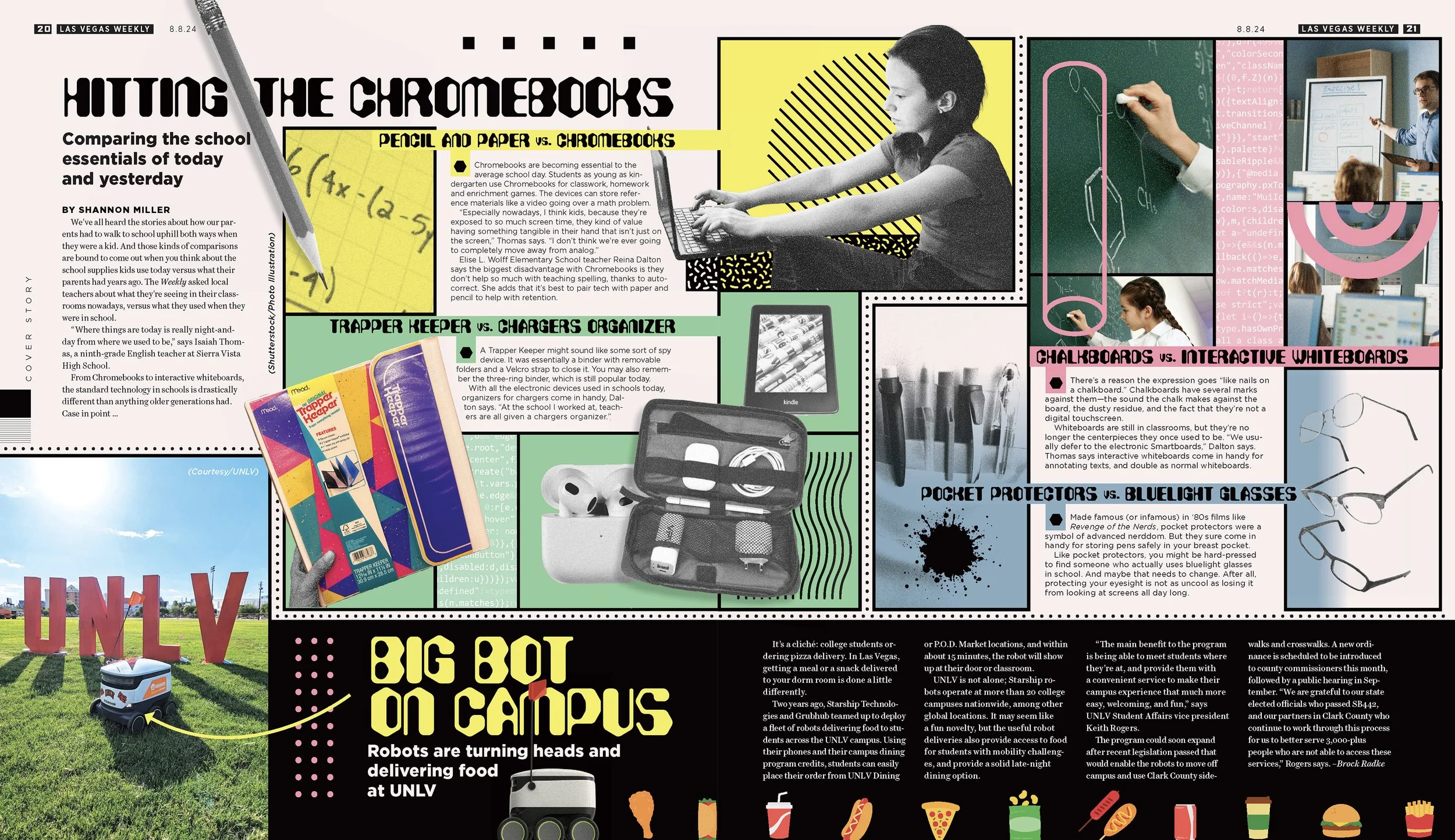
ART DIRECTION FOR ILLUSTRATIONS
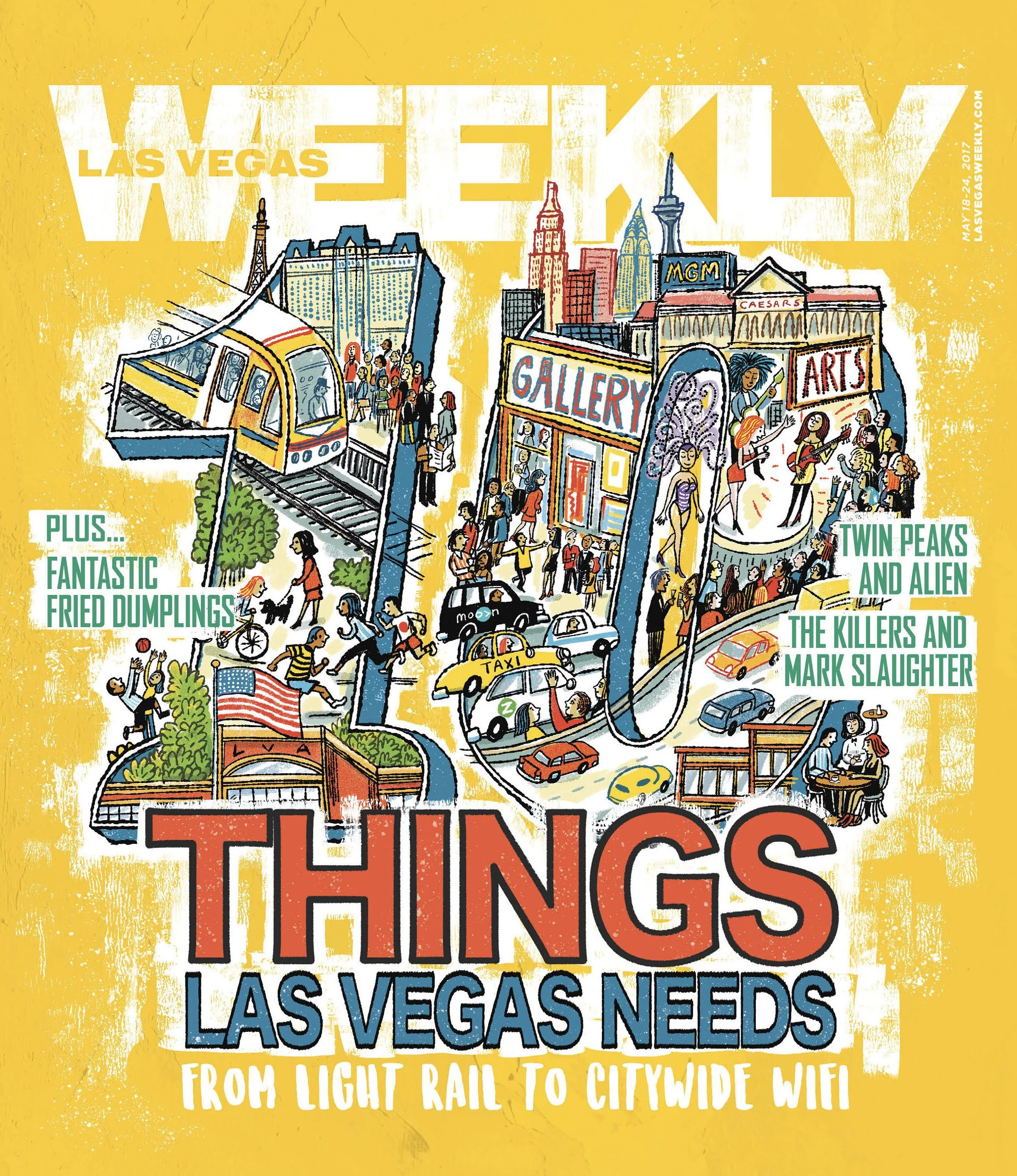
As much as I love illustrating myself, I also enjoy finding and working with other artists. I would find artists through Workbook, social media, or even people in my own community. After getting approval to hire the freelancer I would work in tandem with the illustrator. I would present their rough draft options to the writers and editor for approval. Then I would check in periodically to provide notes and make sure we were still following through.
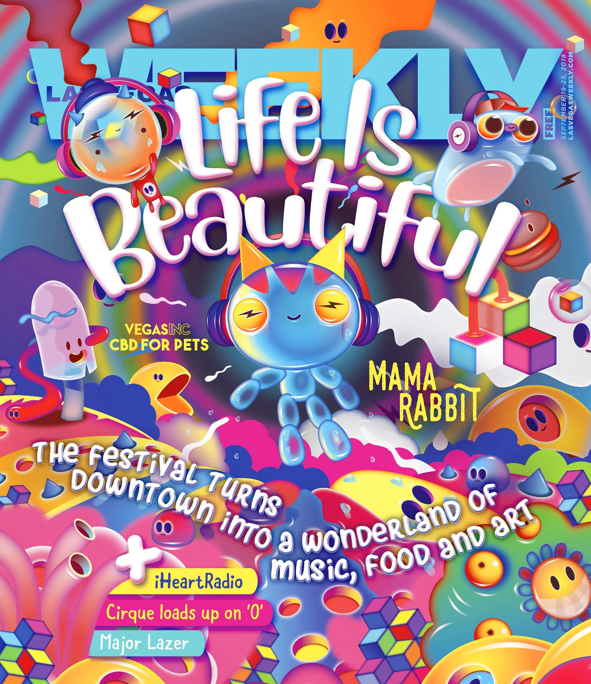
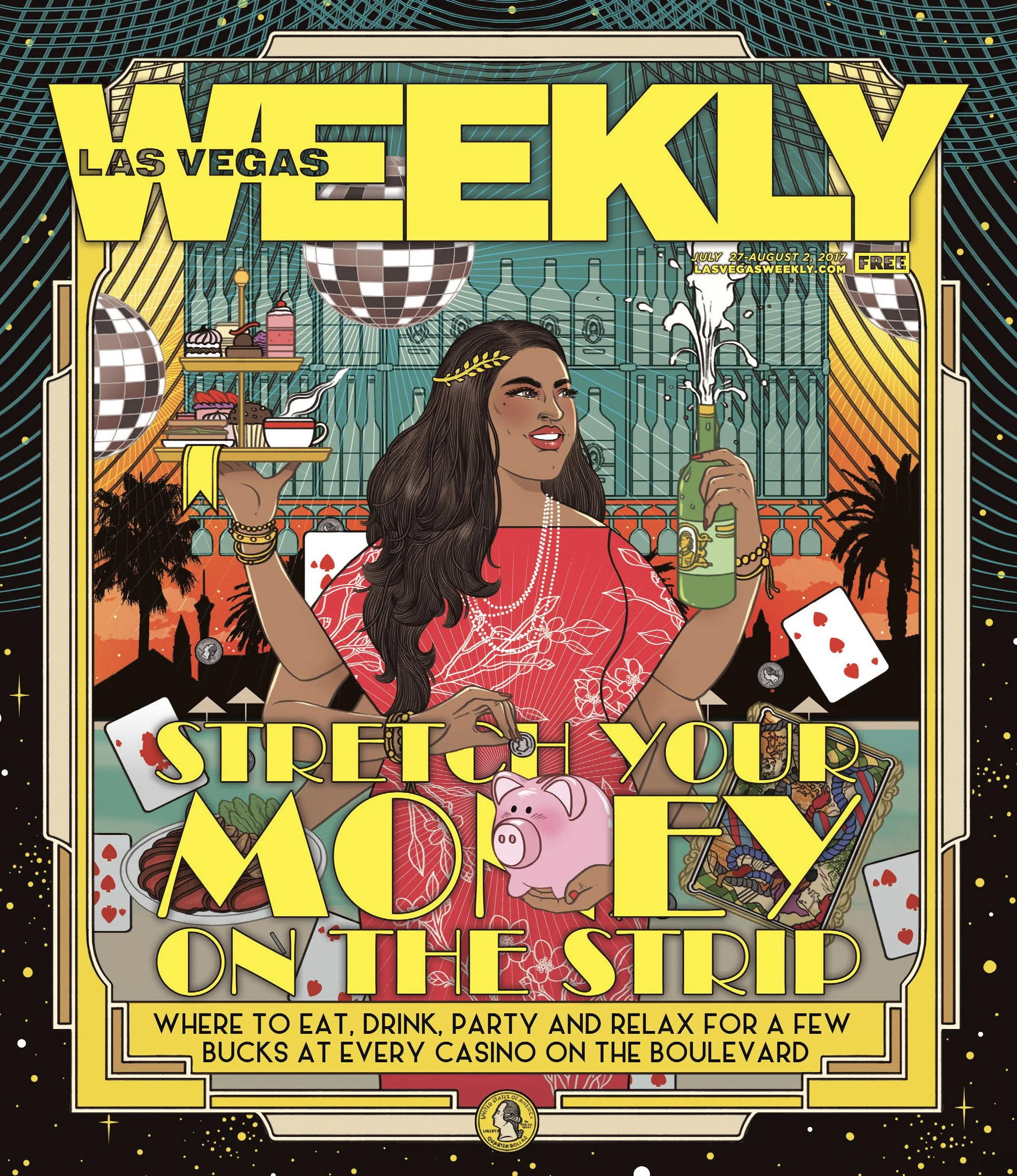
Below are a few illustrations from artists I’ve art-directed. From left: Robert Nuebecker, Sally Comport, Poked Studio, Kristina Collantes
ACCOLADES
Nevada Press Foundation
2023 Outstanding Graphic Designer
2019 Best Graphic Designer
Association of Alternative Newsweeklies
2025 Editorial Layout/First Place
2024, 2019 Editorial Layout/Third Place
2018 Cover Design/First Place
Best of the West Journalism Contest
2020 Best Page Design/Second Place
WORK AT THE MOB MUSEUM
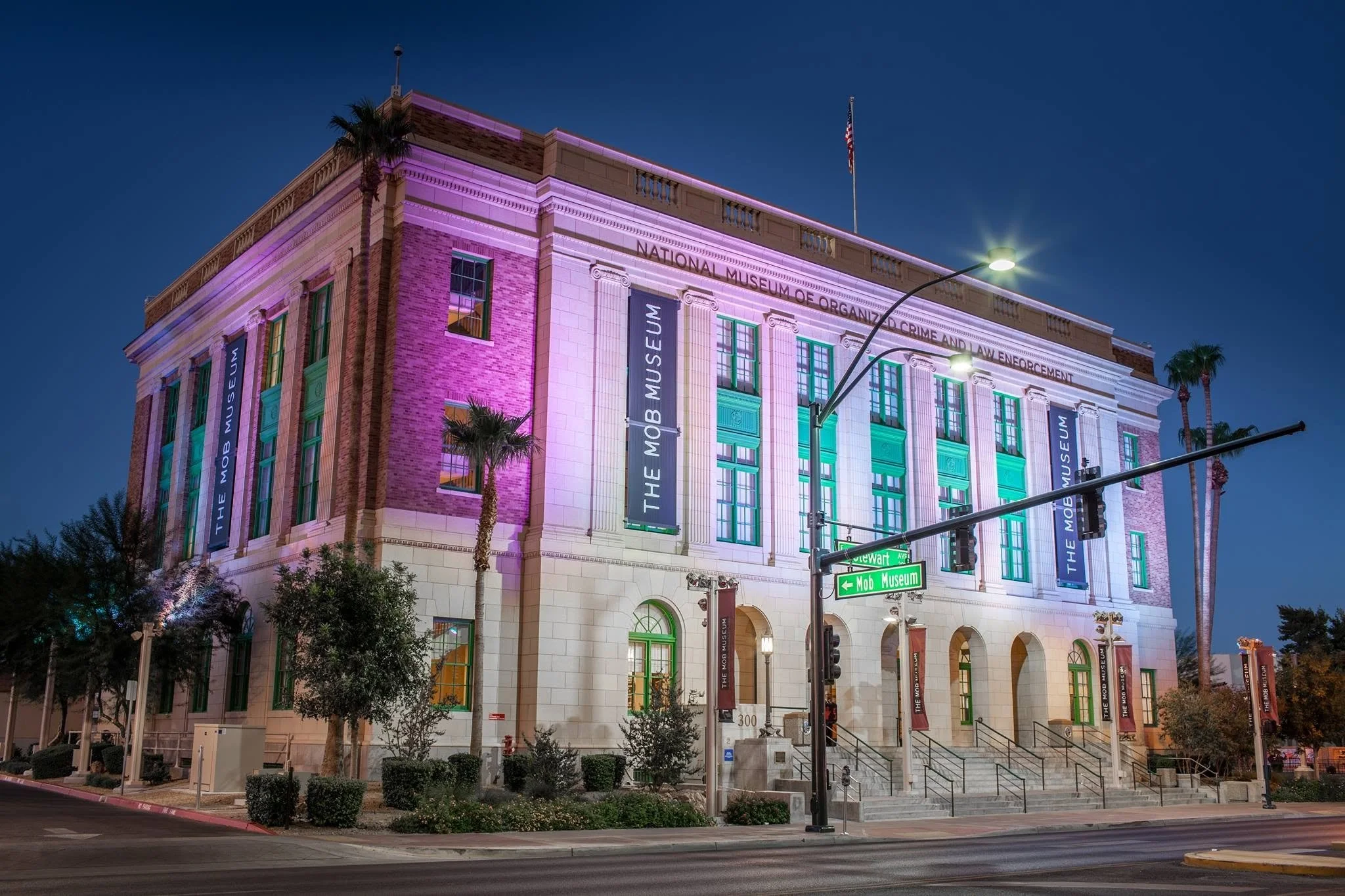
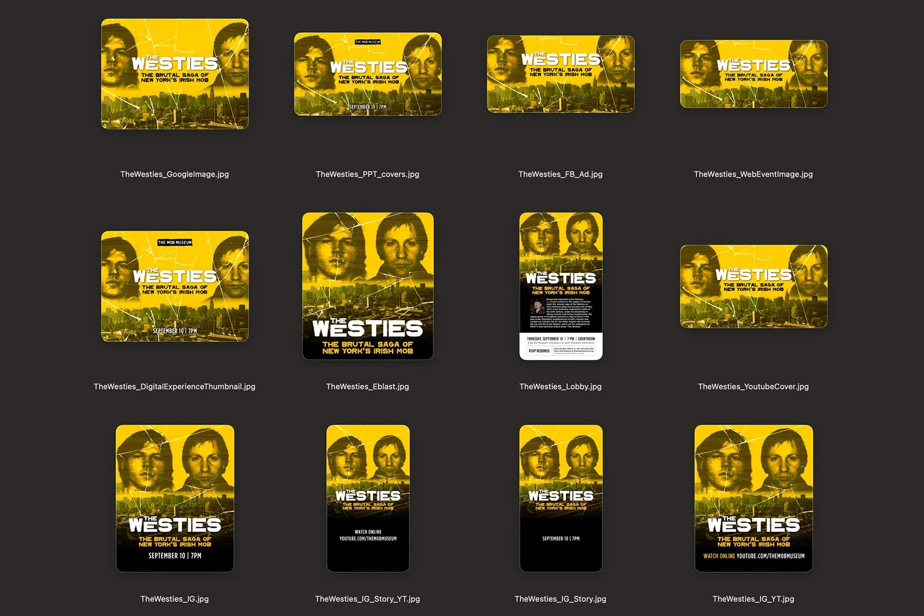
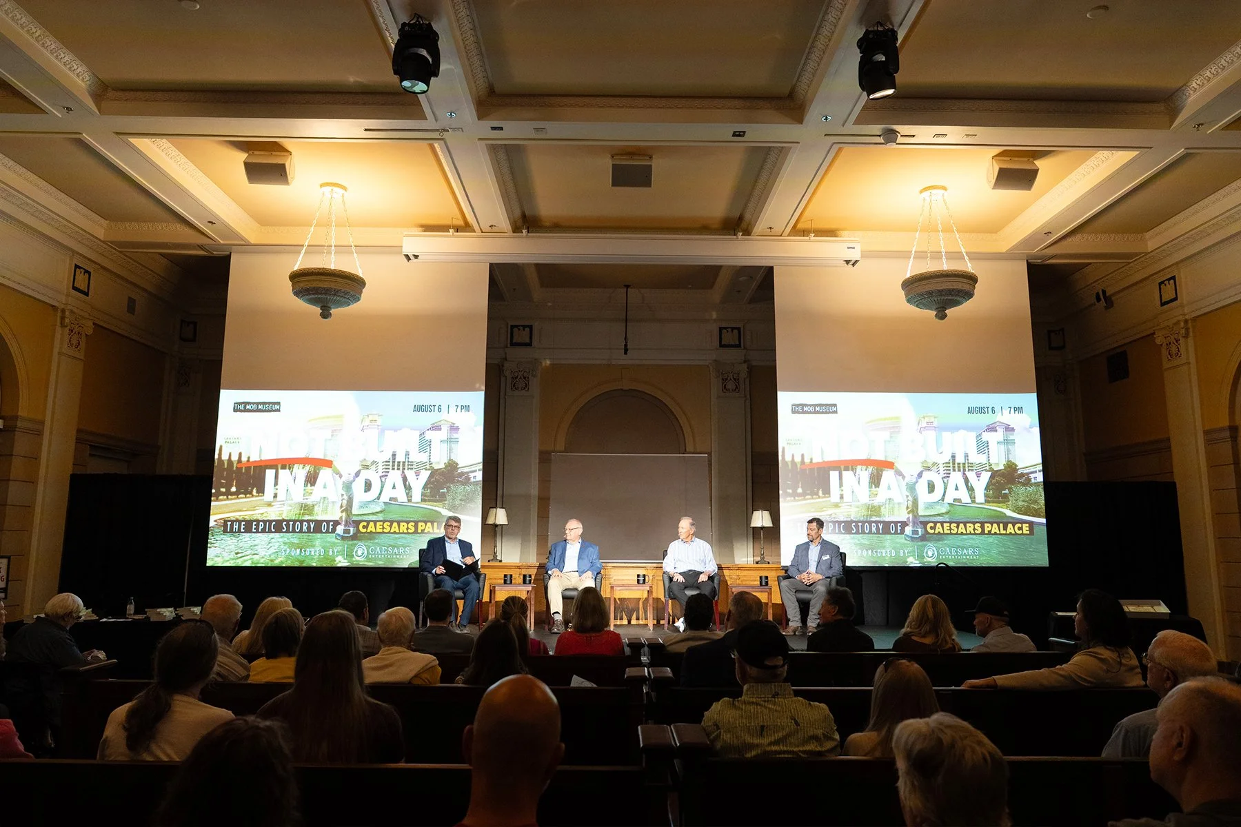
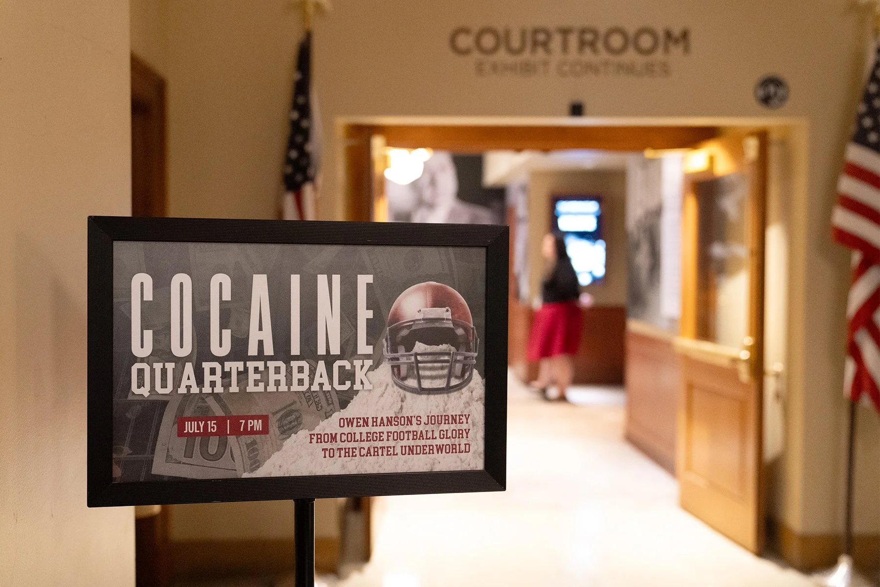
The Mob Museum is a 501(c)(3) nonprofit housed in Las Vegas's former first post-office and Federal courthouse, focused on the country's mob history and its relationship to law enforcement.
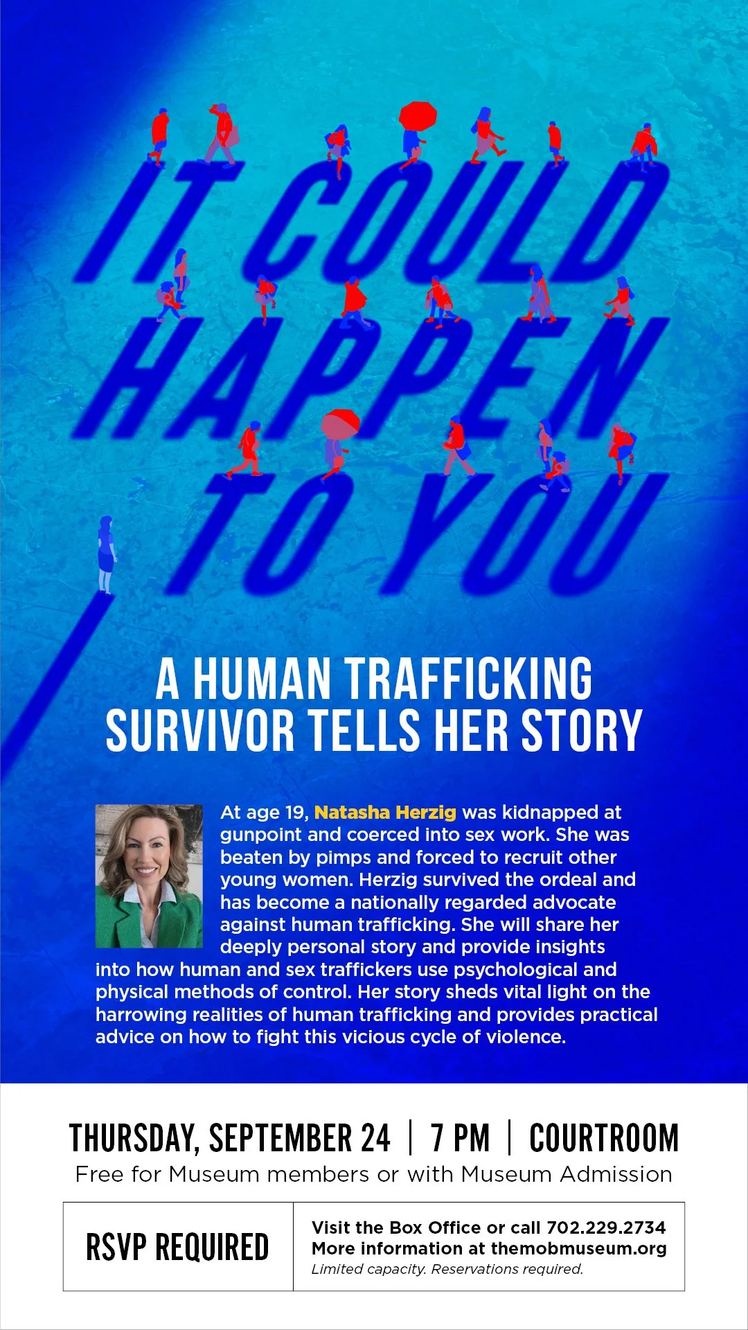
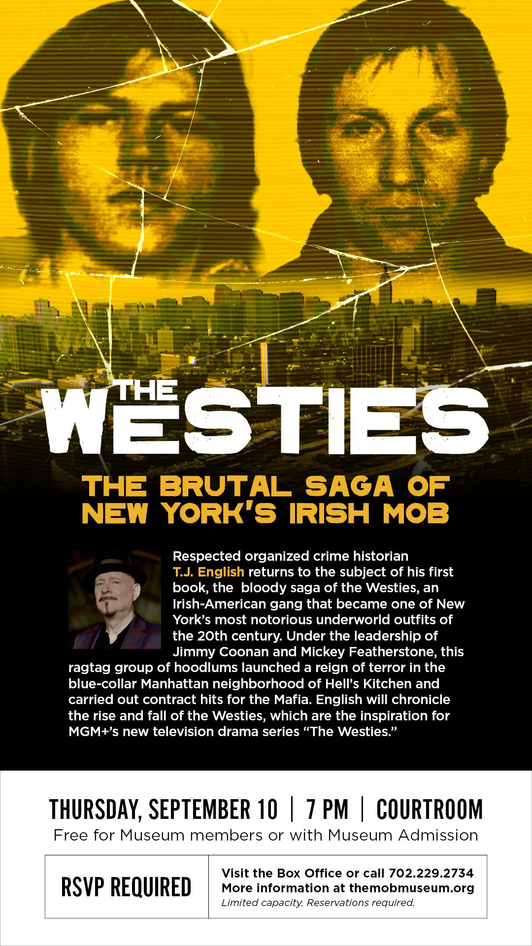
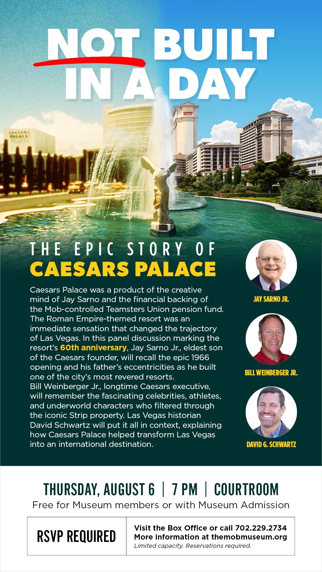
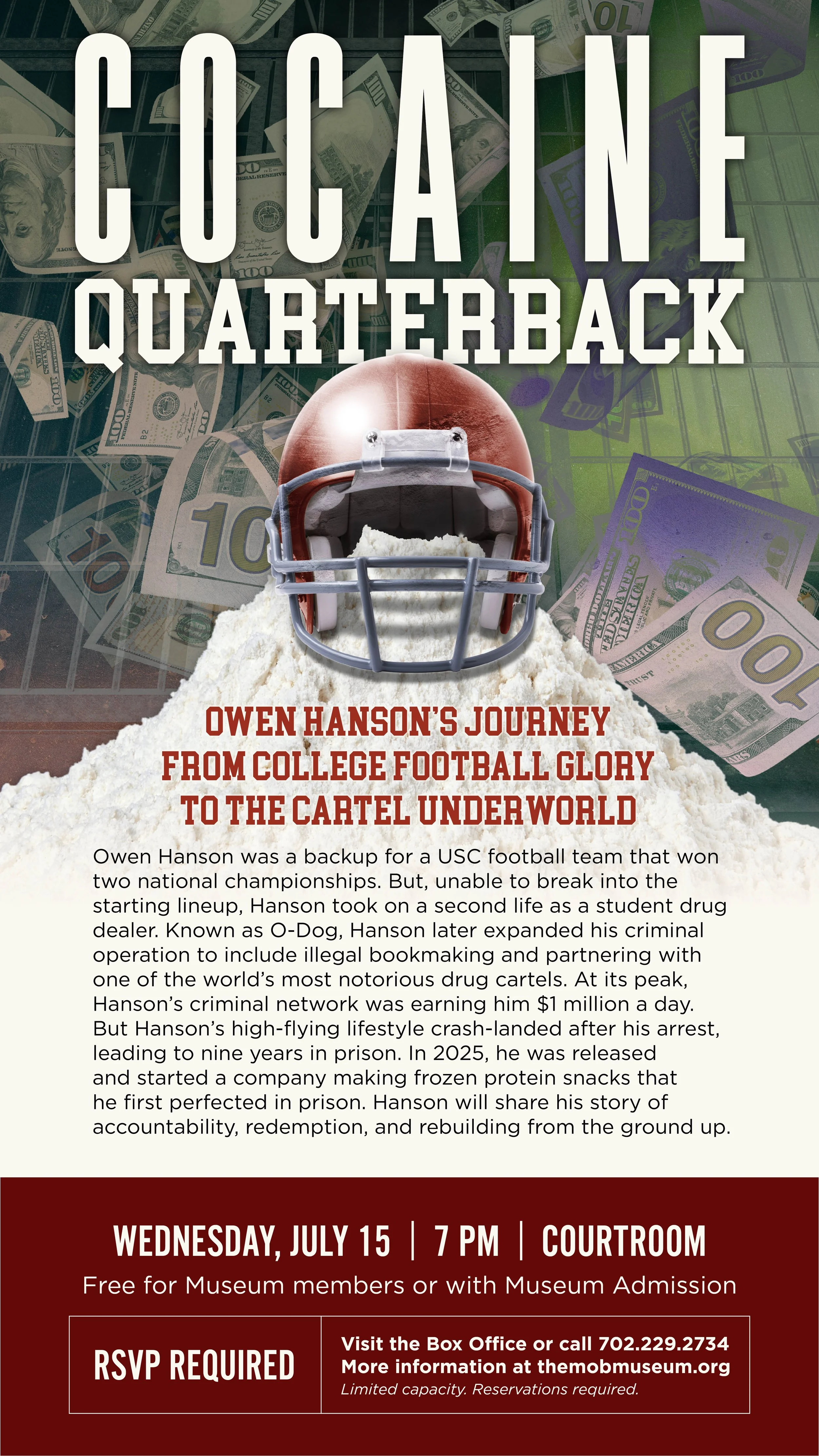
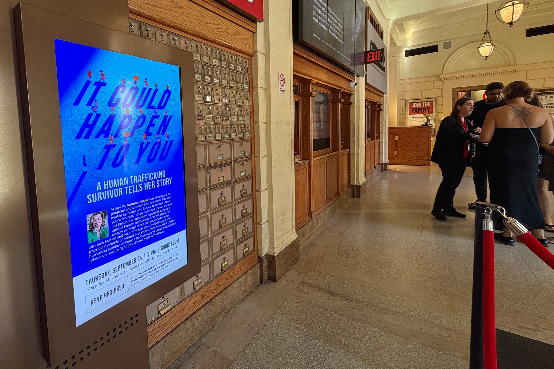
One of my recurring projects is creating visuals for monthly event programming. Speakers come to the museum's former courtroom to share their stories in front of a live audience, later published online. Below are examples of that programming art, which end up on displays throughout the museum, in eblasts, on social media, and in print.
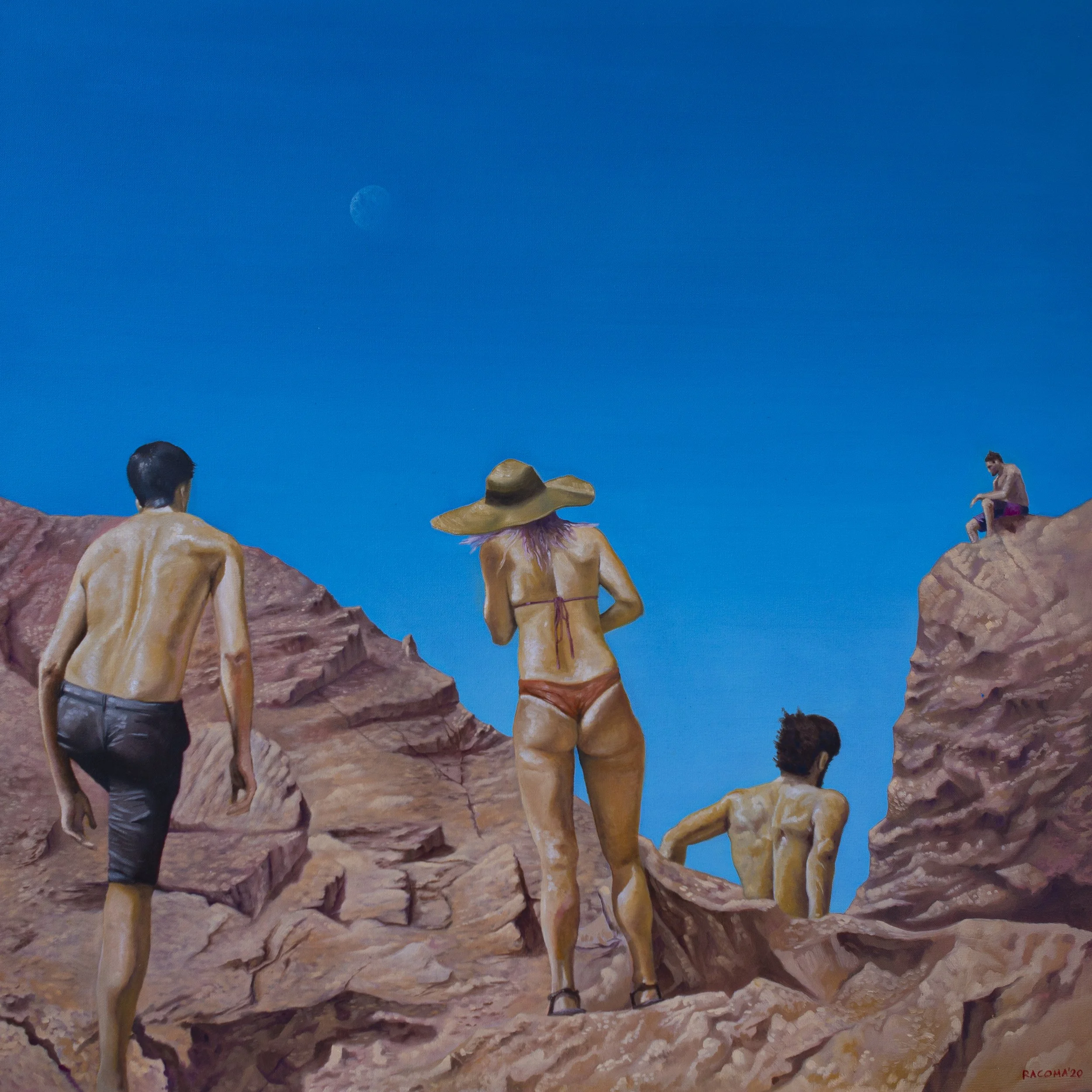
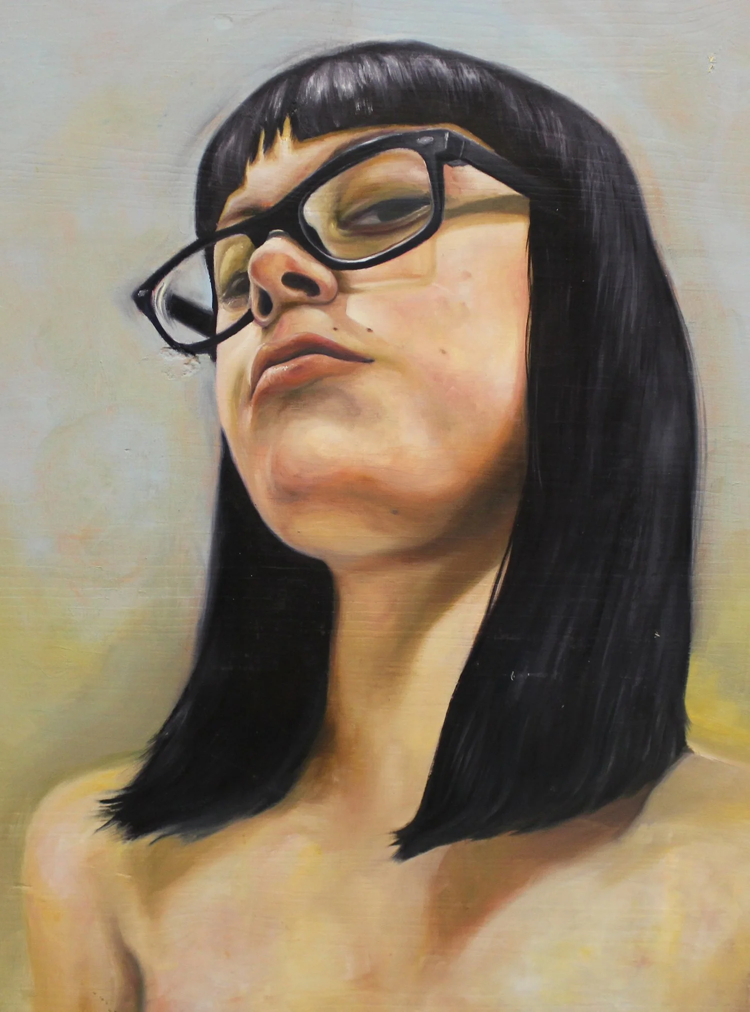
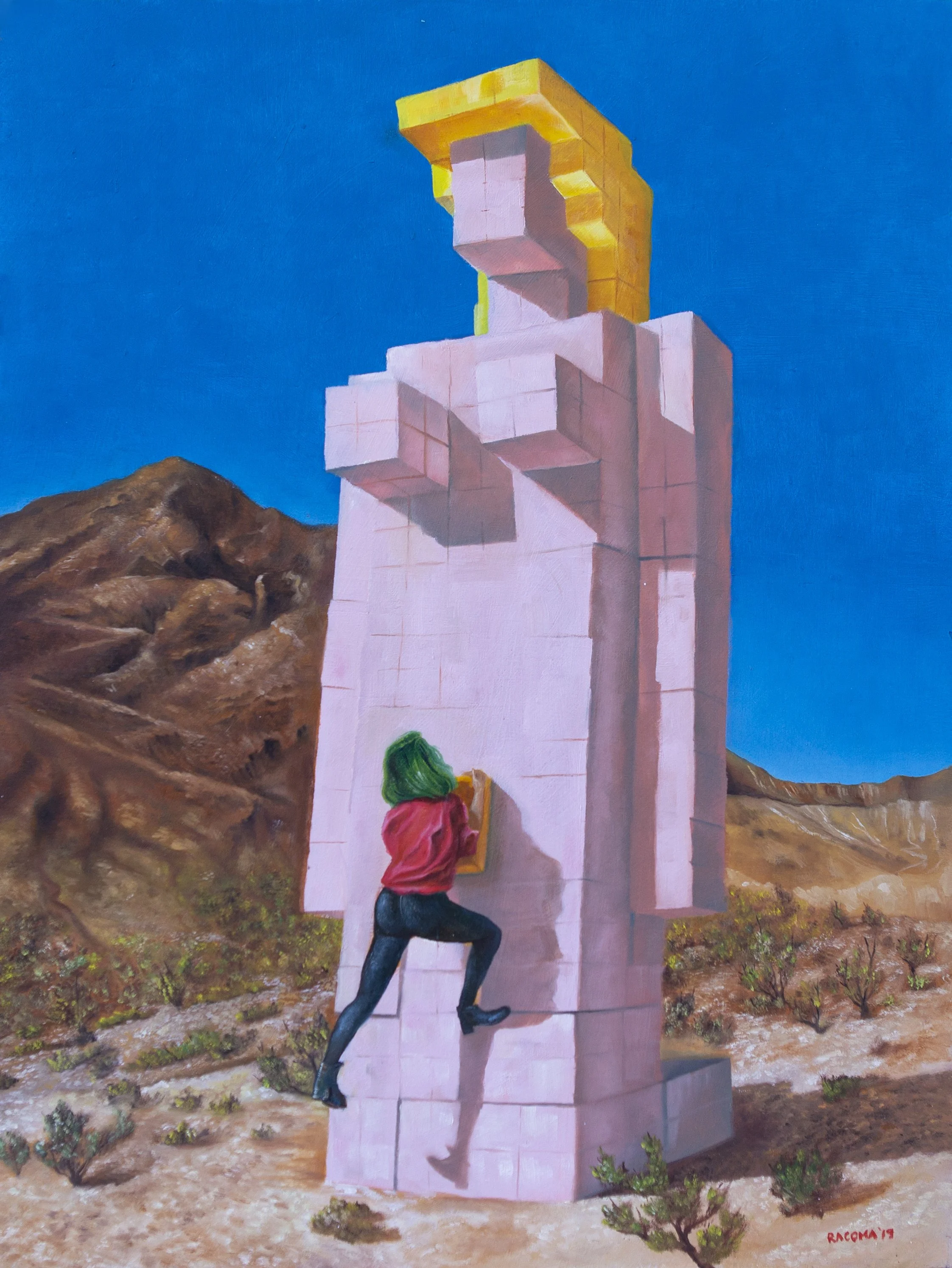
Art has always been the foundation I work from. I put real time and care into visual storytelling, whether it's a personal painting or an editorial assignment, because at the core, both come from the same place.
PERSONAL WORK
(Note: This is a custom link. Leaving this page will require you to re-click the provided link or input www.ianracoma.art/the19th in the address bar)